.greetings steemians
.i was recently commissioned to help a business with the look and feel of their interior
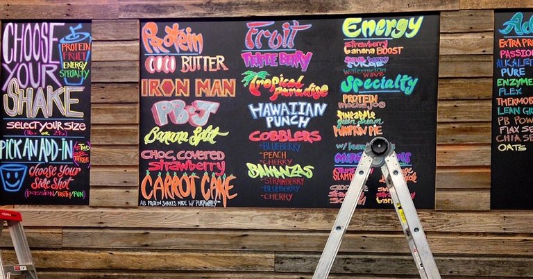
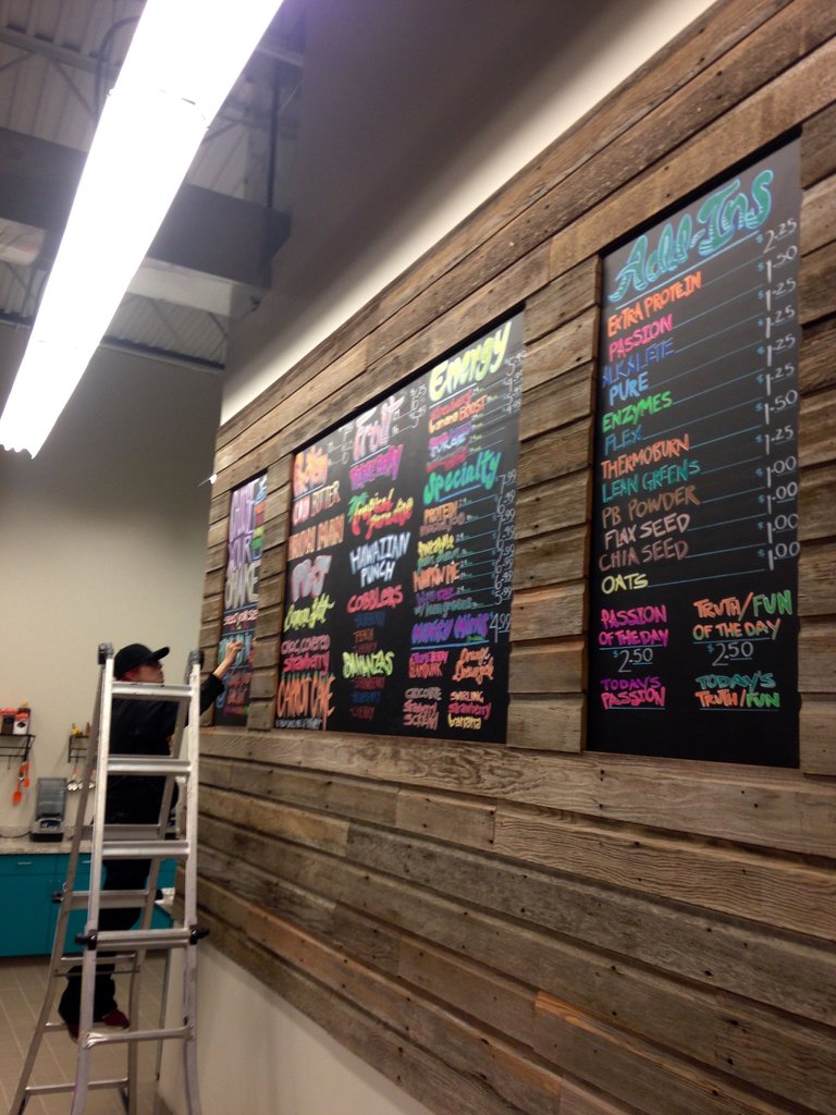
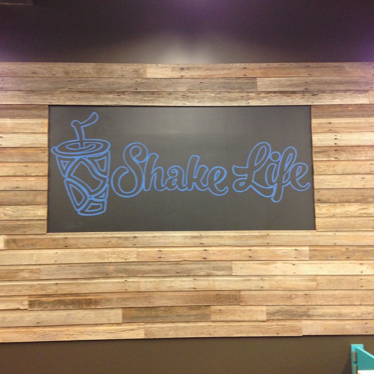
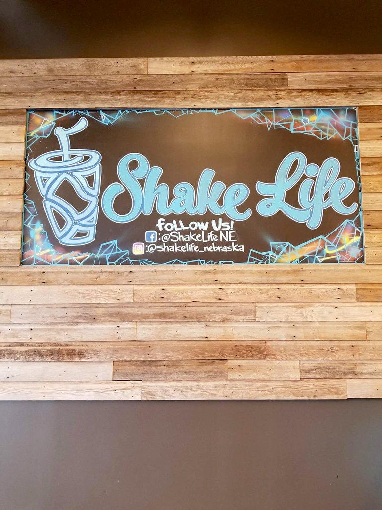
.initially, the owners of Skake Life, a healthy smoothie shop, asked for my artwork to give a unique look to their chalk boards
.i used Versa Chalk pens to create the colorful details inside the custom lettering
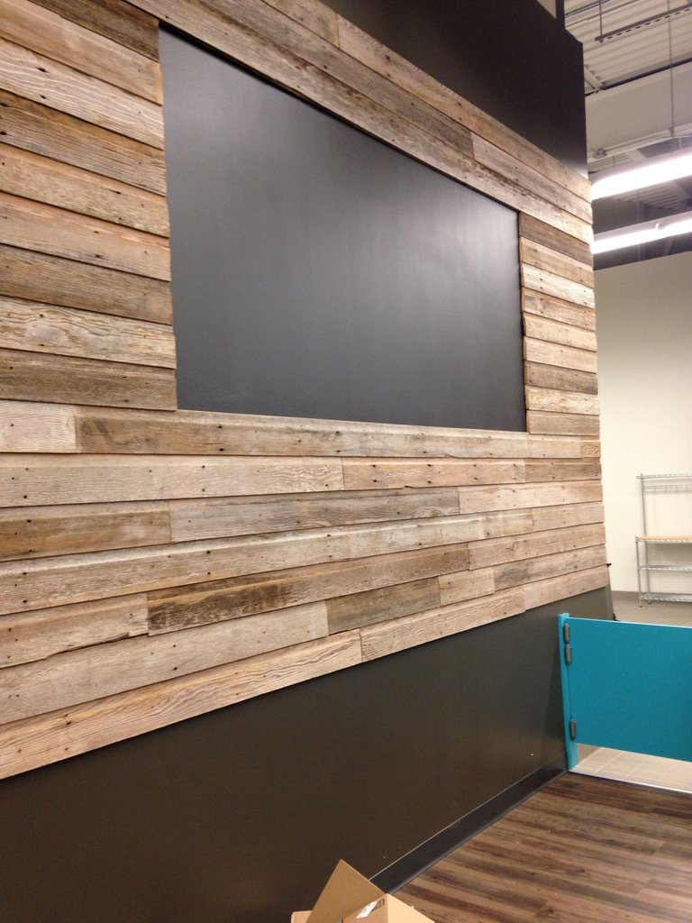
.next I projected the company logo into a board in the center of the business
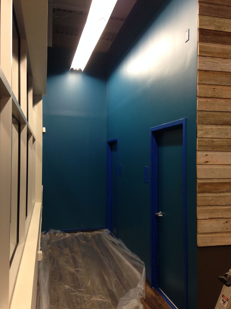
.i left the chalkboard above alone while i moved over to the corner by the front window which leads to the bathrooms
.i will be adding some colors to the edges of the board with spray paint for a continuous feeling after muraling the adjacent walls
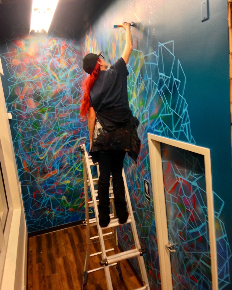
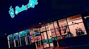
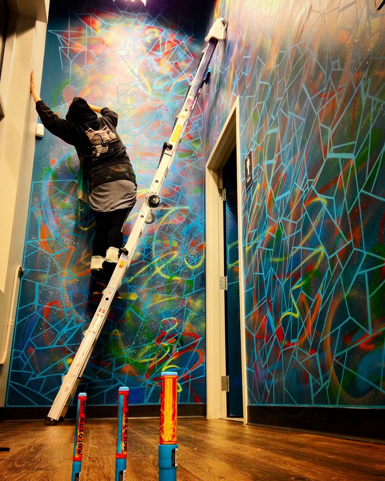
.the corner is visible from the street so i wanted to provide the business with something vibrant and eye catching to draw in passers-by
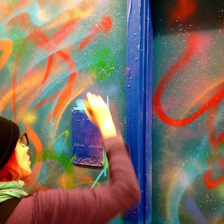
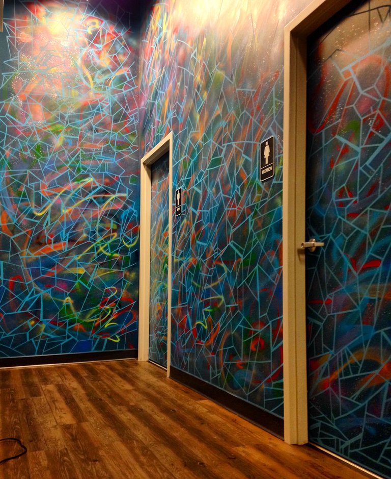
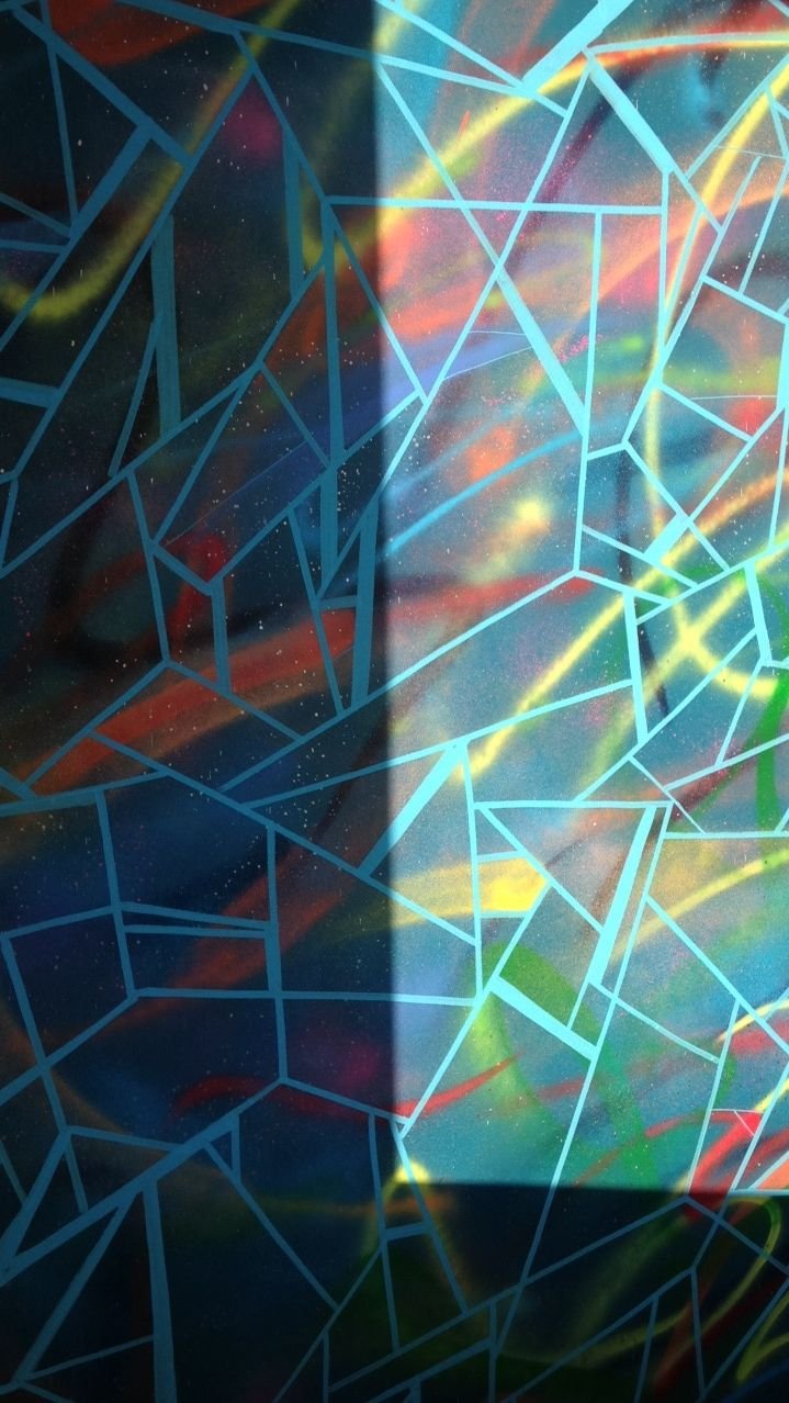
.for this part i worked with a variety of spray paints making my bright background then took 3 sizes of Molotow paint markers in shock blue over the top providing an abstract fractal pattern
.the result is an unusual flow of shades and shapes
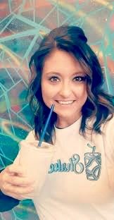
.now used as a spot for customers to pose for a "healthy selfie"
(Jennifer Hartman of Shakelife)
.i went to back to the logo chalkboard and added some touches to make it match the mural
.this was a good spot to place their social media information as well
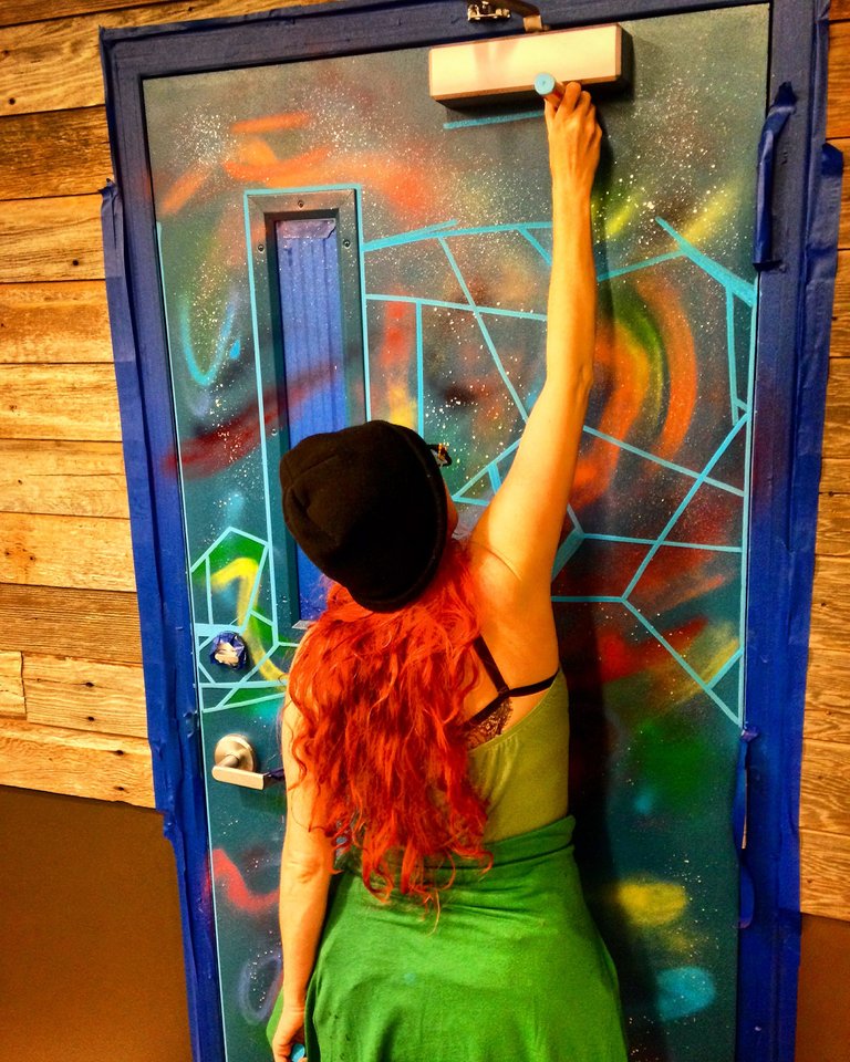
.looking around the room i noticed the door leading to First Pick Performance, the gym next door, looked rather bare so i decided to continue the blue fractal mural there again for continuity
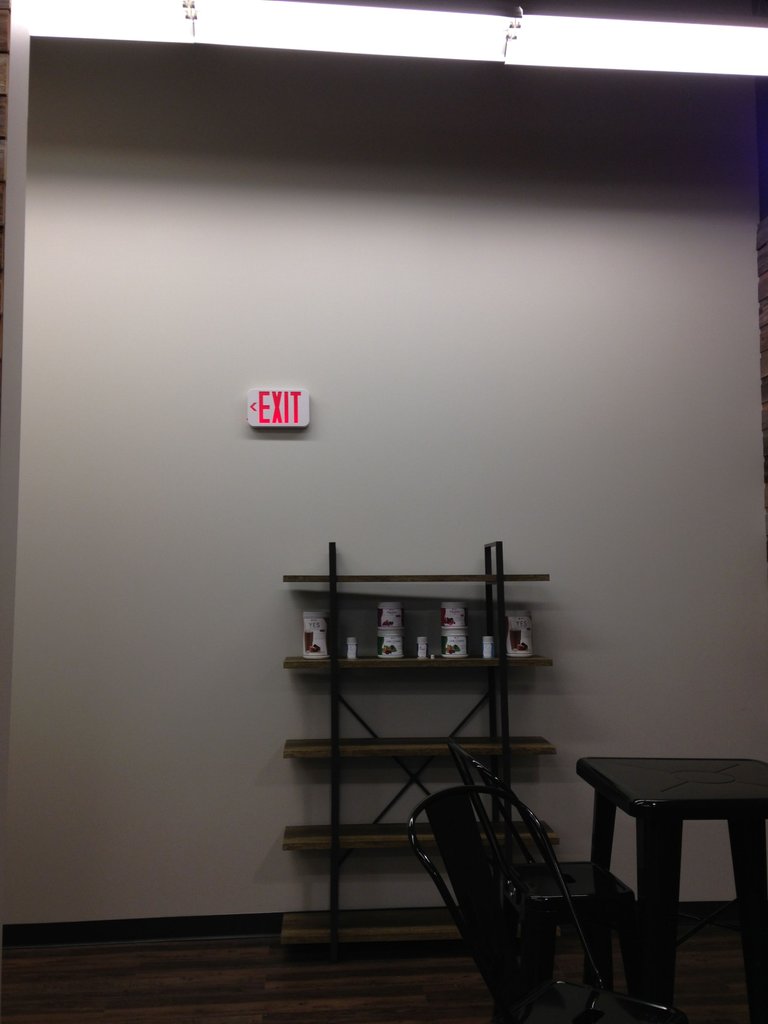
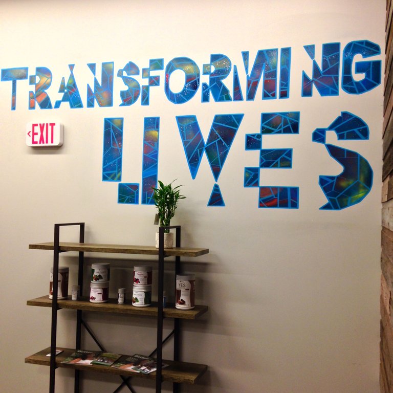
.one final space was left untouched so i asked the owners for a word or phrase they felt was the message of their business
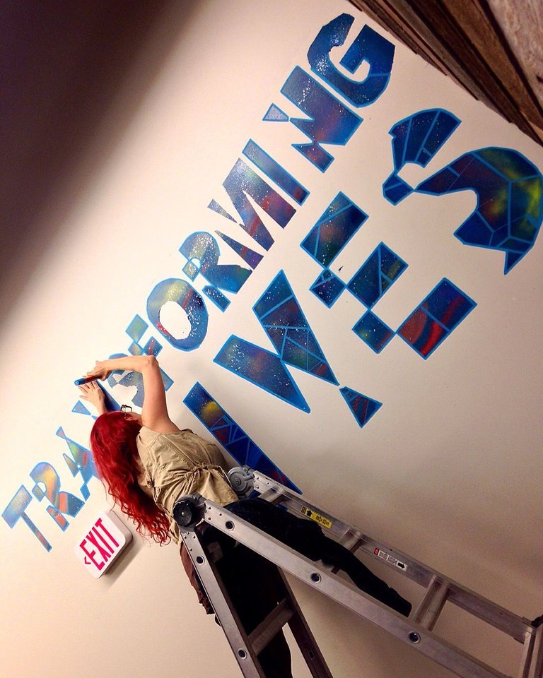
.TRANSFORMING LIVES seemed very fitting so i wanted to make them a custom font for the area
.i taped out the letters and painted them with the same steps as the muraled wall and door
.the final outcome is fresh and inviting
.thanks so much for viewing my #originalart
.photo credits: @buzzjunior ❤️
.norm4eva

I really love your style. Doing branded murals like this is my ideal method of painting. You get to create or enhance an entire space. Your square patterns are sick and make for a good use of space on large scale projects like this. Dope letters, dope colors, dope hair lol. Keep up the dope
.haha
.thanks man
.yeah I guess I specialize in creating environments and brand cultures through one of a kind art
.i appreciate your insights!