Hi @quinneaker. I'm really glad to be back on the platform. :D
Logo challenges are super fun. I was basically thinking about something I might wear on a t-shirt.
The green background can easily be changed out to be any color. Since "Digital Network" is in white text, I knew it would be washed out if I posted the transparent background. Here are a couple of examples with minor changes to it:
Great to have you back!
Ya I get your point...can basically take that logo and put it on any background. I like the blue the best so far but would like to see something a bit stranger with POP as this is a digital advertising network which is all about the IMAGE of attention and PIZAZ!
Yay @merej99. You answered the call. So glad to have your creativity up in the mix! I love the varied width swoop around the words, ending (or beginning) with the dot of the i. Nice texture on the letters too. Simple. The green isn't my favorite, but the design I like A LOT!
Hey @merej99 haven't seen you in a while, what a nice surprise!
I also like it, simple but unique, uniform....Do not like the green though....
Hi @quinneaker. I'm really glad to be back on the platform. :D
Logo challenges are super fun. I was basically thinking about something I might wear on a t-shirt.
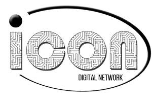
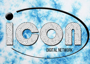
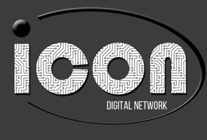
The green background can easily be changed out to be any color. Since "Digital Network" is in white text, I knew it would be washed out if I posted the transparent background.
Here are a couple of examples with minor changes to it:
black text
black text - blue tie dye
white text - gray background
Great to have you back!
Ya I get your point...can basically take that logo and put it on any background. I like the blue the best so far but would like to see something a bit stranger with POP as this is a digital advertising network which is all about the IMAGE of attention and PIZAZ!
Very creative! Love that you filled in ICON with a circuit board pattern. Thanks for your entry!
Yay @merej99. You answered the call. So glad to have your creativity up in the mix! I love the varied width swoop around the words, ending (or beginning) with the dot of the i. Nice texture on the letters too. Simple. The green isn't my favorite, but the design I like A LOT!