After my Major Screen Time film essay about Her and the themes of modern disconnection that I posted the other day, I just couldn't get the film out of my mind.
Even though I said to myself that I've been spending too much time on Photoshop lately and have been neglecting my writing, I was just too damn inspired and wanted to make something. Due to the (mostly meaningless) Award Season coming up, I wanted to honour this film in my own way as a homage to its Best Original Screenplay win back in 2014. Even though the Oscars are really just a glorified pageant, politics trumping merit most of the time, it's nice when truly deserving talent is rewarded.
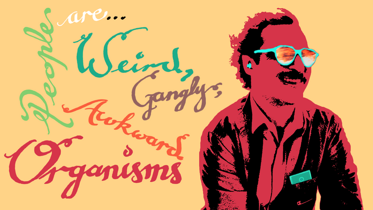
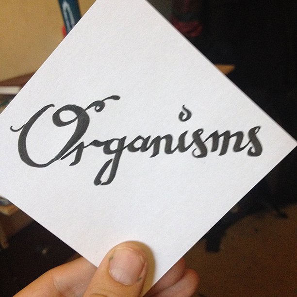
Also, the line, "weird, gangly and awkward organisms," is one of my favourite lines from the film, said by an AI that has the capacity to feel more than humans can, and has a completely different frame of reference to reality and people.
The line really resonates with me because humans are weird: we have weird bodies, weird things called emotions, strange thoughts that only we can hear call imagination. We love, we hate. In the greater scheme of things, in the face of all the evidence that we are a fluke, the fact that we exist as we are is amazing and beautiful, and we must wear our awkward gangliness on our sleeves!
So, with those thoughts rattling around my head, and a desire to make something, that's exactly what I did, the result of which is featured above.
I can't really claim to be an artist, I'm more of a super-noob remix artist, but making digital art is a new experience for me, a new outlet, a hobby. To me, the beauty of creativity is in the act of doing it. When it's done, good or bad, you can sit back and revel in the fact that you did something and learned from the experience.
So, what I'm going to do now is just talk you through my process a little, if you're at all interested. I might do this more often, so let me know if you found this interesting, and if you would like more or less detail!
This was a relatively simple project, using a few of the skills I've learned over the last couple of weeks.
First things first: Finding an image that perfectly encapsulates the beauty of Her. After a couple of minutes of searching I found this one on Google image, and then had to find a decent resolution to work with:
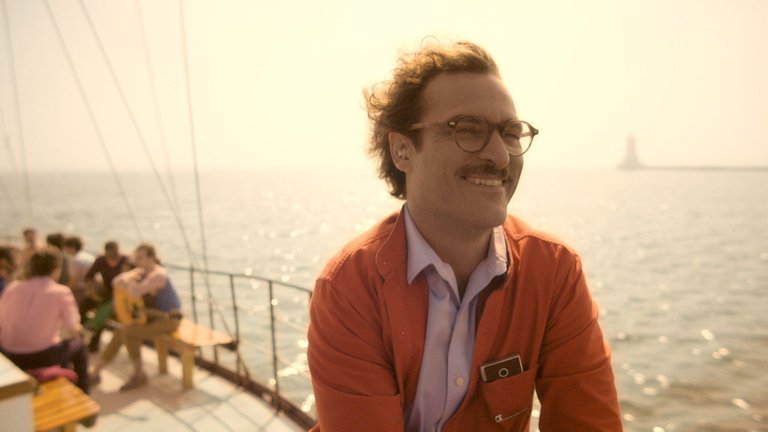
This frame comes from just after Theodore and Samantha (his AI) companion go on a "date", really enjoying each others' company. You can really see Theodore's joy, and that's why I love it. It encapsulates one of the best, sequences in the film for me, and is tinged with a bittersweet sadness at knowing how things will change.
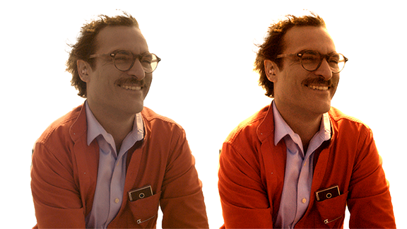
Next, I imported the image into Photoshop CC and started playing with the levels to get a good contrast around the edges so I can separate Theodore from the background using the Quick Selection Tool. Because the colours and focus were so soft it was a bit tricky. You can see the differences after I made the selection, here :
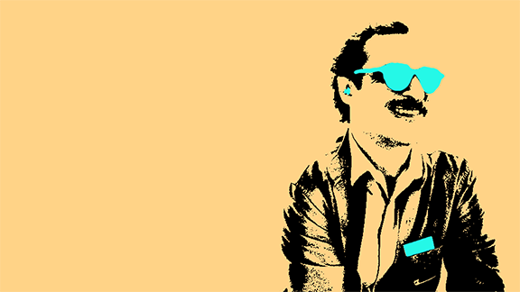
With the selection dialled-in and using the Refine Edges tool to get as much of the squiggly hair as I could, I made a New Layer and filled the selection with a nice vivid, but softened pinkish colour, inspired by the film's poster— I absolutely love the visual boldness of the poster. I also chose a nice soft peachy colour to compliment the colour.
I then went about using the same processes as above, selecting the phone, the earpieces and his glasses, and filling them with a nice, happy bright turquoise blue.
Then, I added a Threshold Layer to the adjusted image, so that only the dark parts would be visible, I changed the Blending Mode to Multiply to hide everything else but the black parts, and added some Levels Adjustment Layers, adding Mask Layers and painting back in the details I wanted with a soft brush.
(This process was a trick that I learned from the Photoshop Training Channel on YouTube for making Banksy-style Graffiti, which you can see here. I used this technique to make the artwork for my story The Window).
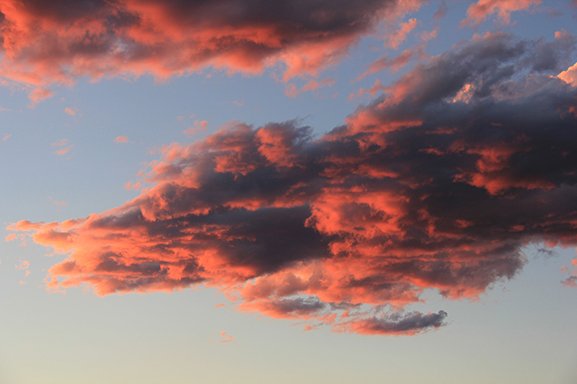
Then, using the Polygonal Lasso tool, I cut out the lenses of the glasses (very roughly which you can see), found a cool sky and cloud image, made a selection of the lenses layer and added the selection as a Mask to the image, duplicating the layer, and setting the top layer's Blending Mode to Overlay, and its Opacity to about 50% Opacity—a quick and dirty way to make the colours pop and heighten the contrast.
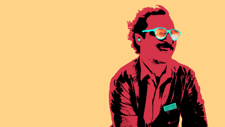
Finally, I really wanted to add one of my favourite lines from the film, as I mentioned above. I wanted a font that felt handmade and rough, imperfect, just like humans, so I asked @your-nomad-soul to do some calligraphy for me, which he warmly obliged (BIG thank you to him).
A couple of hours later he sent me good-quality pictures of the finished lettering, which were absolutely gorgeous, and then I started importing each word he made individually into Photoshop, selecting the text with the Magic Wand tool, added some levels to make them flat-black, chose the colours, and then spent the next hour or so messing around with the arrangement to get it right.
And finally, the finished product was born!
I hope you enjoyed my process, which wouldn't be possible without @your-nomad-soul's help. Once again, Thank you!
Let me know if you're interested in more. I'm still learning and practicing as I make stuff, so I'm sure I'll improve, but it was really fun to make.
Until next time, I'll see you in the comments!
Scribo, Specto, Lego, Cogito,
Ergo Sum

Four mentions, ey? :P
Love that film, dug the essay. Also, these process descriptions are both engaging and educational. I like it :)
Viva le collaboration :)
PLM
Nomad
Of course! You deserve a gazillion mentions!