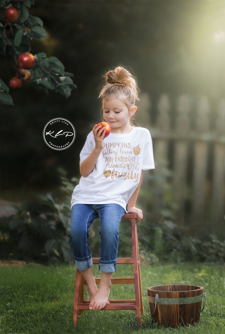
It has been quite a while since I've posted, but with Autumn nearby, I could not resist sharing this photo of my biggest little one.
A little background on this photo...recently, I was contacted by some friends of mine who own a screen printing business. They wanted to see if I would be interested in a cross promotion with them, and with our collaboration, they would send me new shirt designs each month. In exchange, I would provide them with a few photos that they could use for their website. Of course I agreed. I loved the shirts, and I always try to support our local businesses.
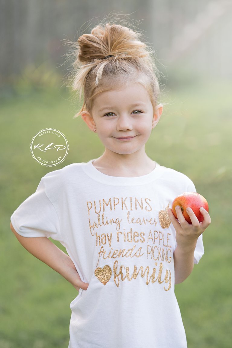
I had decided that I wanted to offer "apple picking" photo sessions to my clients, as a way of putting a twist on the typical fall photo sessions that are usually offered. I had mentioned this idea to the screen printer and this is the design they came up with:

I loved it, and they had the shirt to my door the next day.
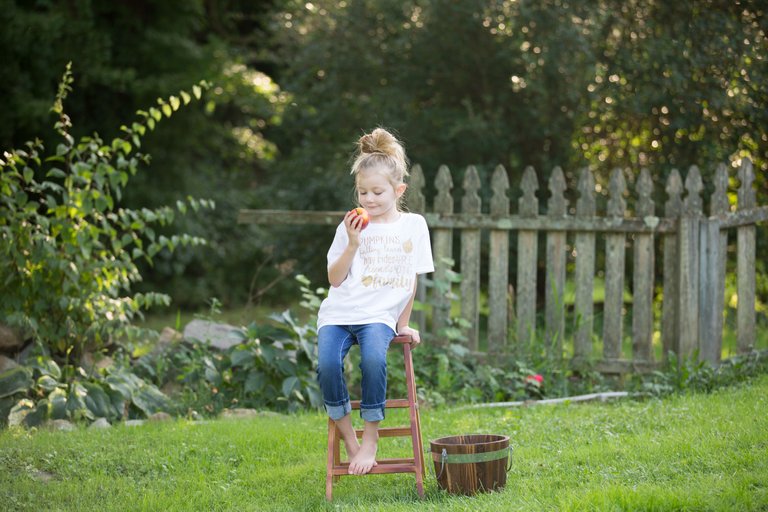
My next step was to find an apple orchard to take the photos in. I had contacted a few places and found one that agreed to allow me to have my sessions there. The problem was, I wanted to put the ad out right away (cause I'm super impatient) so I decided to dress my daughter in the shirt and head out to our front yard (ice cream is always the best incentive). I handed her an apple and snapped away just to get an idea of what I wanted to do. After reviewing them, I wasn't too happy with how any of them turned out, since I really wanted the photos in an actual orchard, so I almost scrapped them. Then I came across this one that "spoke to me":

I loved her expression, but clearly, it wasn't the apple orchard background I was hoping for. At first, I figured I would crop her out and place her on a new background, but none of the backgrounds that were available seemed to be what I was looking for. So, I decided to try to work with what I had.
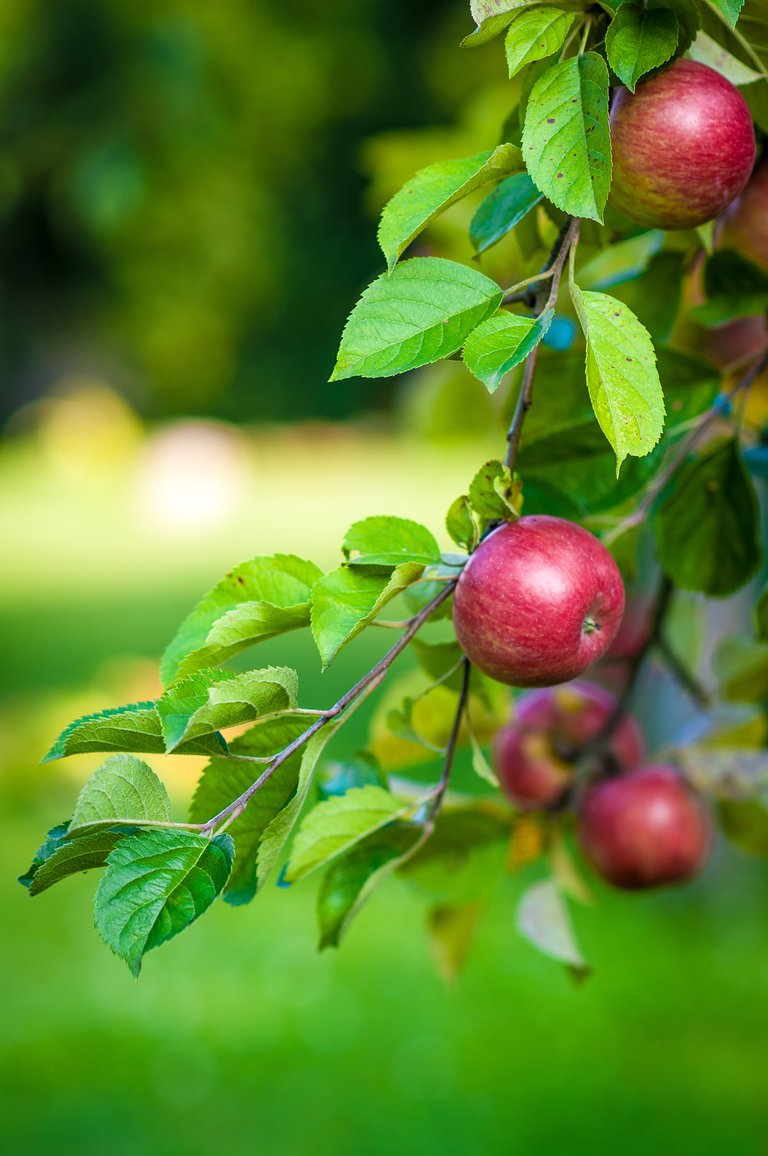
I began by cropping, then reducing the yellow tones in the green grass, and warming up the image. Next, I selected my daughter and added her to a new layer. I blurred the background more, then darkened it. Finally, I added a bit of sun flare to give it a "dreamy" look. The results were good, but it was missing something. Considering it was meant for an apple picking advertisement, I sought out an image of an apple tree. This is what I found so I added it in:

In the end, I do wish the bucket next to my daughter had apples in it, but after the amount of time I poured into the photo, I just couldn't bring myself to work on it any longer. Overall, I'm pretty pleased with how it turned out, considering I started with a simple photo in my front yard, and ended up with something quite different. Thanks for reading!
Credit for the direct stock link (and the Etsy shop for the tee shirt) can be found below:
Etsy Store: https://www.etsy.com/shop/BrandElleDesigns?ref=search_shop_redirect
Apple Tree: https://pixabay.com/en/apple-tree-fruit-food-484529/