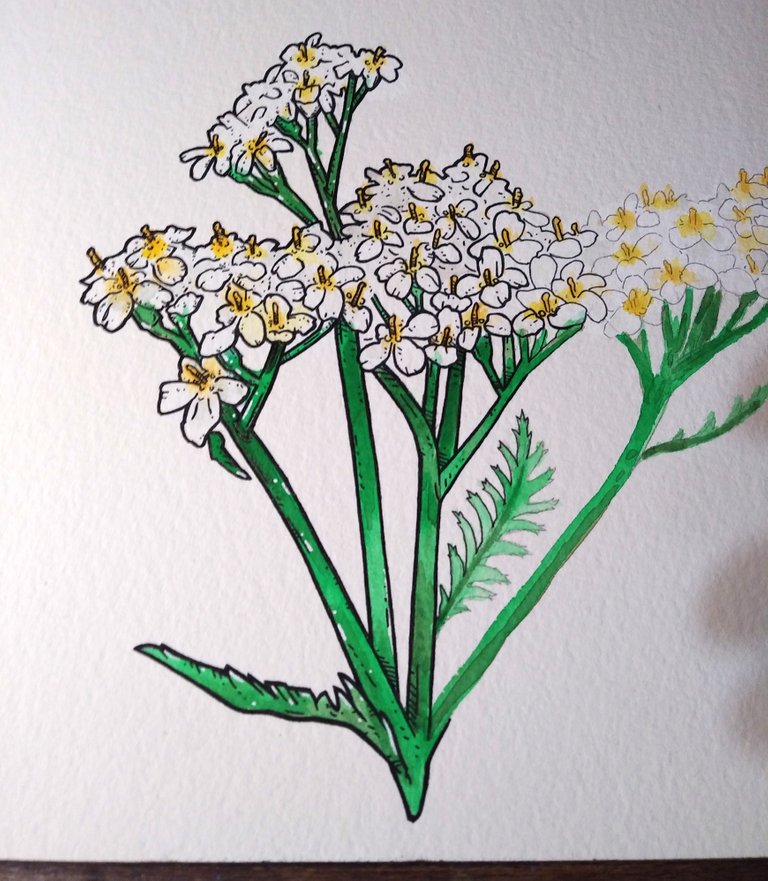
Working on a little logo for a local event and they wanted a yarrow flower. First I thought this was gonna be an easy one, but I quickly found out that I was wrong hahahaha. It took me a little bit of sketching to get a handle on how to go about this one. I didn't want to outline every single flower and sort of muddle up the whole thing, so I tried to keep an overall shape and pull out more details the closer the flowers are to the viewer. I think it came out as a good first draft and now I know a lot of ways to make the next one the final one that can be used for the logo. Back to the mess :)
Acrylic and ink on watercolor paper....
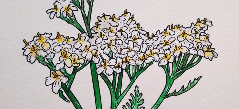
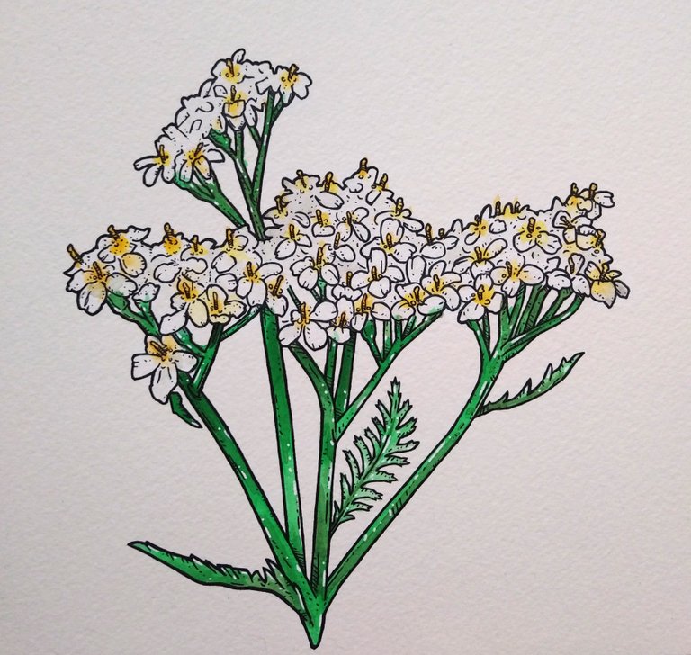
Here's a bit of the process...
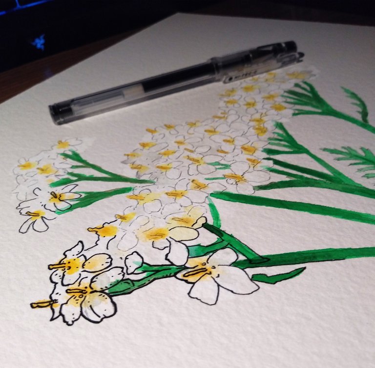
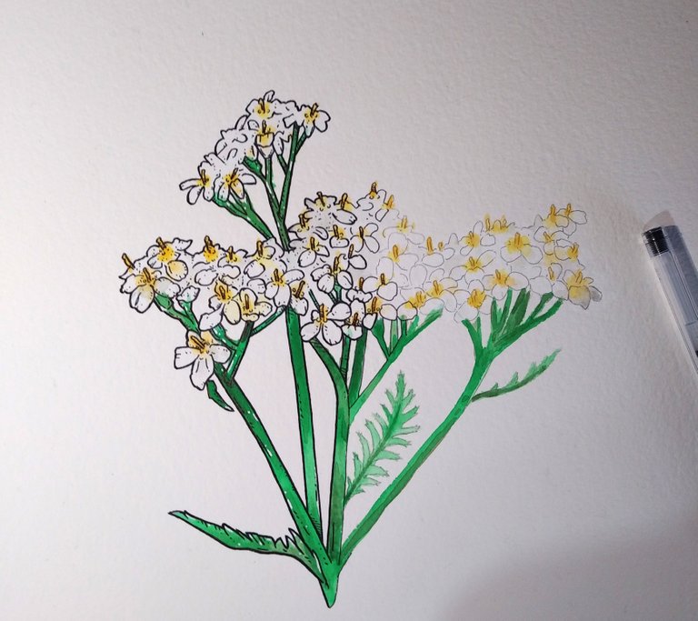
Thanks for stopping by and checking out the arts...
Instagram: instagram.com/cardboart
This post was shared in the Curation Collective Discord community for curators, and upvoted and resteemed by the @c-squared community account after manual review.
@c-squared runs a community witness. Please consider using one of your witness votes on us here
Not only animals (and bread!) but also you are talented in drawing plants too :)
Hahaha... I do a bit of arts :)
What kind of an event was this? I like the logo. It looks simple at the first sight even though there is a lot of details when you look carefully.
Hahaha, we often make assumptions without thinking it through and then we're surprised that something goes differently than we wanted. But you did very well and you delivered a lovely logo.
Thank you for sharing and have a good weekend!
Its for a mothers day event with a bunch of art, and food, and things like that. I'm pretty sure it happens a week or two before mother's day... lol I still need to find out the details. Gotta love those happy mistakes :)
Drawing a mass of flowers with any detail looksd pretty tough. The results look good :)
Thanks a lot, it def took me a little bit to try and understand how to make some of the flowers stand out from the mass, but still have it get a good overall shape. Was good practice for the final one for sure.