Hi, everyone (designers and non-designers). Today, I’m in the mood to write. Don’t get exhilarated. My writing will not take your breath away. But you could read without picking up a headache.
I’ll be talking about the design principles I’ve been working with since I started designing. I started designing less than 6 months ago. In all honesty, I didn’t start using these principles when I got started in design. I was slowing accruing them in bits. I could do this through feedbacks, learning (articles, books, videos). Developing an excellent design taste also helped.
Keep in mind that I’m still growing. You could find yourself not agreeing with my opinions. I wouldn’t expect everyone to agree. I want feedbacks too; I could be doing something wrong.
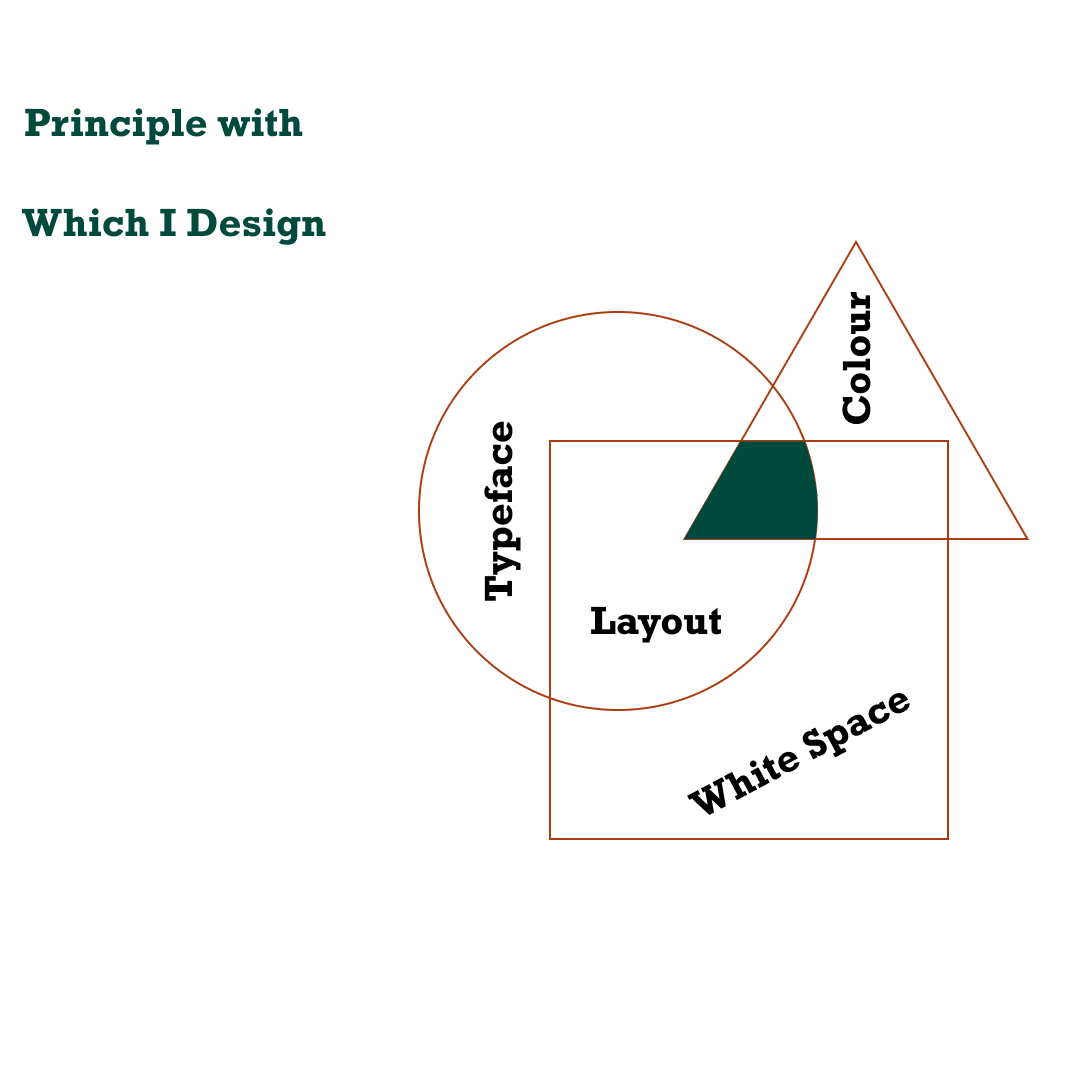
When I’m designing a random interface (web or app), the first thing I do is to decide. I decide on colour, typeface, layout, and spacing. I could pick up this principle after reading Refactoring UI by Adam Wathan and Steve Schoger. Before then, I found out these areas of design take most of my time. I spend hours deliberating on what colour to use, combination, what typeface would fit the design.
I got over the colour drama by choosing a single colour to use. It was easy to come to this resolution. I found out that the most popular interfaces have a single colour. Notable examples include Duolingo, Spotify, Netflix. So, I decided that a single colour is often enough for the design I need to make.
Choosing Typeface is easier. I don’t pair typefaces in most of my designs (that’s if I’ve ever done it). It’s a risky thing to do if you don’t understand it well. So, I use a single font but different weight, size, and sometimes colour, for contrast and hierarchy. My favourites are Poppins, Lato, Roboto, Montserrat (free Google fonts).
For my spacing, I stick with the 8pt system. I’ve found out it makes my design neater and modern. This point system also makes it easy for me to set up my grid system, size icons, and choose line heights.
Another thing I keep in mind while designing is the negative space. You can also term it “white space”. These areas of my design are places with no design element. I like to give my designs breathing space. I’ve noticed that white space helps. It helps to emphasize a design element, typography.
These principles have made me improve my design skills. They also reduce the time I spend doing designs. I know some of these principles could be hard to follow in real-life design. Based on some constraints that could be technical or financial.
In creating grand designs, you need to have some principles guiding you. I’m not resting on my laurels yet; I still have a long way to go. I’ll not stop seeking knowledge, constructive, and practising my craft.
It feels good writing again. I hope to write more this month. Let’s see how it goes. Till then, share the design principles you always have at the back of your mind while/before designing. Share your thoughts on how junior designers could get better. Thanks.
See you soon.
Meanwhile, I'll be posting this on my Linkedin too. You can connect with me here here
Congratulations @donaldpete! You have completed the following achievement on the Hive blockchain and have been rewarded with new badge(s) :
You can view your badges on your board And compare to others on the Ranking
If you no longer want to receive notifications, reply to this comment with the word
STOPTo support your work, I also upvoted your post!
Do not miss the last post from @hivebuzz:
Support the HiveBuzz project. Vote for our proposal!
👋 Hi @donaldpete, I was flipping through the blockchain and stumbled on your work! You've been upvoted by Sketchbook / a community for design and creativity. Looking forward to crossing paths again soon.
✅ Join the Sketchbook Community