[ INTELLIGENTXIA ]: origins

Deep within the hybridized alternative culture of Los Angeles is what set the stage for what is now a dynamic initiative
to actualize the imaginative creativity of the mind's eye into optically accelerated graphics. I was born and raised in
Los Angeles, and am both founder and lead graphic artist for intelligentxia. Influenced by the ever-evolving cutting-edge
digital era that is now being ignited and propagated by intuitive artists worldwide, intelligentxia has initiated its own
innovative path to create phenomenal masterpieces of graphic design. In a city like Los Angeles, art is everywhere.
Whether in nature or synthetic, Los Angeles is encoded with an observable deep magic. Early on in the introspective
years of his adolescence, I was hardwired with a creative sight and skill to generate personal as well as collaborative
projects. During this enthusiastic youthful epoch, I became a percussionist, enjoyed surfing, learned video mixing
and editing, took photography classes, developed technical computer skills, enjoyed secret underground all night events
and networked with LA's unique natives. All of which contributed to advancing the necessary mindset in order to set
the foundation for intelligentxia.
After seven years of experience designing graphic art, editing videos, creating animated gifs, designing websites, mixing audio
and taking photos, I have definitely answered a calling in the media arts. With a variety of clients, both domestic and
international, intelligentxia has a diverse portfolio in various fields the likes of musicians, artists, hackers, infosec,
information technology, surfers, actors, corporate businesses, techies, magicians, ufologists, writers,
mathematicians, photographers, cryptologists, cipherpunks, cyberpunks, geeks, conspiracy theorists and futurists.
The artistic philosophy of intelligentxia is that the art has to not only look amazingly awesome, it has to feel amazingly awesome.
The art itself, whether it be a video, a logo, an animation, a graphic or a soundscape, is a manifestation of what once
was only an idea. To be able to see one's idea brought to fruition by an artist who can tap into your creative genius is ideal.
Before intelligentxia came into fruition, it was known as audiotive.net
audiotive.net (no longer existent) was short lived and worked as experimental grounds to develop what would become intelligentxia. The art was the same but the name needed to change. The name audiotive didn't make sense and was very hard to connect with a complex description of where I came up with it. I did once try to explain how cymatics (a subset of modal vibrational phenomena, that is, how sound frequency creates geometric shapes) but for some reason I thought maybe the name should be upgraded to something more relevant. Finally, after first creating a logo that could also be typed in regular text (.:i:.), and also looking through a few hundred words that started with the letter "i", I finally found one; intelligentsia!, but of course the domain was already taken so then I modified the word and used an "x" instead of an "s" which takes nothing from the pronunciation at all. Loved it. Went with it.
One of my favorite projects was creating the logos and graphics for Cyphercon:

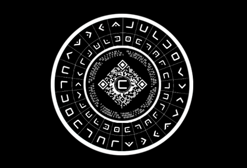
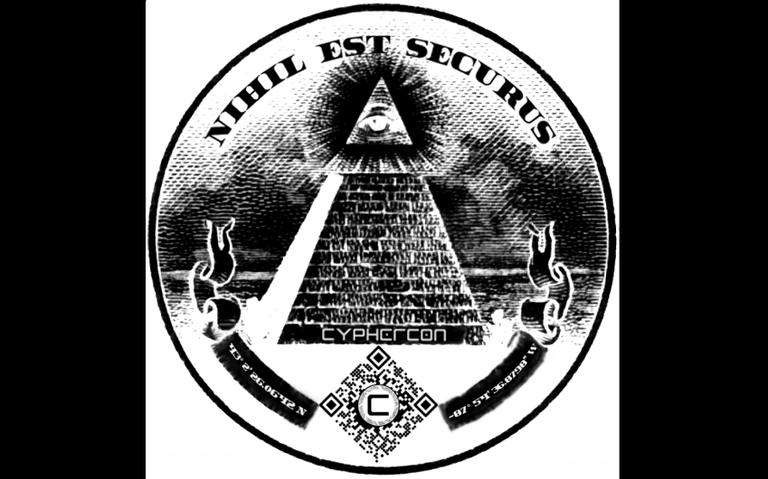
The QR code logo itself, although combined with two different types of QR codes and having added three rings of binary code with a letter C centered within it all, was designed to be scannable, although it leads nowhere now because the specific url has now changed on their official website after an overhaul and upgrade during the second annual conference. Oh yeah, I forgot to mention what Cyphercon is. Cyphercon is a hacker conference (the first ever) in Milwaukee, Wisconsin. So, for me, was a huge honor to be able to make the logos. The third image is a rotating cipher disk concept design that was never put into play like the playing cards that I designed that were used to play a massive puzzle when combining certain sets of cards to win prizes at the conference. Here's one of the cards from the Cypherdeck:
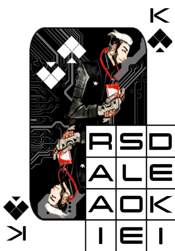
The Cyphercon graphic with the 'all seeing eye' (perfect image for cryptic messages by the way) has [in Latin]: NIHIL EST SECURUS, which translates into 'Nothing is Secure' the banner on both sides of the QR code has GPS coordinates that lead to the first location in Milwaukee to the conference.
Moving on...
Sometimes, with my imagination on a non-stop caffeinated adventure of its own, I design graphics for concept [non-existent] companies and organizations like Deep Blue:

I have no clue what they do. Digital Solutions, yeeeaaah, that sounds cool. At the time I didn't realize that Deep Blue is also the name of one of my favorite songs from Ladytron. The light trail on the left is suppose to represent a digital ocean wave.
I also, for some reason one day, decided that I needed to design a logo for a classy af corporate entity. They had to have either the word worldwide or global in the name. This is where I came up with Venetian Global, a concept Italian financial firm that operated worldwide:
They also don't exist, but just look at its majestic awesomeness.
I also wanted to incorporate into my portfolio some recognizable imagery, like the NASA logo. Everyone loves NASA, who doesn't right? This is one of three graphics I came up with:
I did one day get to design a logo for a good friend from Australia. He operates a company called 'Jarv1s.net ICT Solutions' and still uses that very same logo to this day (the design was a few years back) even though I have already upgraded and presented a new logo which he said he would love to use but he had ordered a few thousand business cards that he has not handed all out yet.
After watching a short documentary titled TITANPOINTE by Laura Poitras (she's amazing) about a secret building in the middle of Manhattan, NY, secretly doubling as an NSA spy center I decided that they needed a really amazing movie poster, so I came up with this:
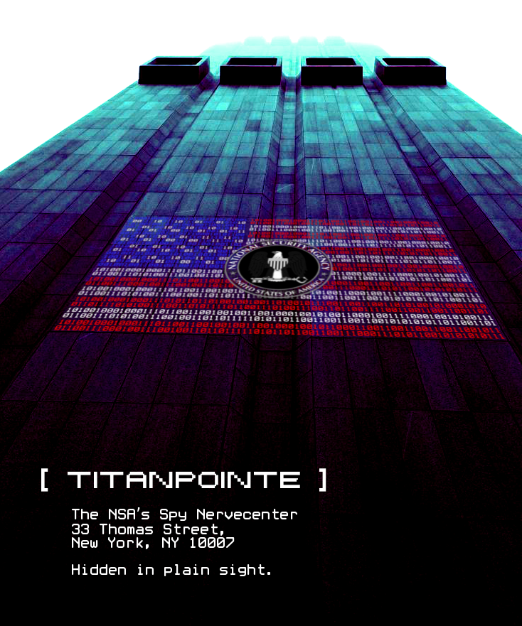
But, before designing this poster I had to design what I needed projected onto that building...so I came up with an American Flag made of binary code with the NSA logo at its center:

Worked out exactly as I had imagined it.
I'm going to end this post here because I can go on and on but maybe I'll make another post like this one depending on reception as my first post here on Steemit.
Hope you enjoyed!
-Erik
Super post