Your Palette
Todays artists have a selection of color that's unmatched to those before the twentieth century. With all the synthetic choices on the market it can be quite a headache when it comes down to choosing which to pick. There are 3 colors within the visible light spectrum Red, Blue, and Yellow. The combination of these colors creates the affect of Green, Orange, and Violet. In combination with the gray scale we can play with these colors to create any natural color you may find in nature. This allows us to limit our palette to 5 colors Red, Blue, Yellow, White, and Black or Brown. The debate on black or brown will probably never end, the argument is that a dark brown such as burnt or raw umber mixed with a dark blue such as ultramarine or Prussian blue creates black and can even be taken to gray when you add white. Black from the tube is usually really strong and almost unnatural, it can overtake your hue very easily leaving it permanently different. Its at these times we must remind ourselves that art is personal and your free to use what you want. That being said when your trying to recreate from the old masters its helpful to know what they preferred in order to find the closest match, and while you can get green from yellow and blue if you plan to paint grass it might be easier to just have a green handy. Your personal style should also be taken into account. For me I must avoid waist at all costs, I try to only pull out what I think I will need a process that gets a lot harder when you have to do a lot of mixing to get your color. With a wide variety of selections I can keep my colors on the canvas as pure from the tube as possible and remix with striking accuracy if needed. It bugs me when i see artists showing there palette and its caked with dried paint. In all mediums little flakes or half dried paint getting into your paint your putting on the canvas is not a good thing. You want to be painting with fresh paint every time to avoid quality issues. I'm sorry for the hate I'm sure to get for that by it had to be said.
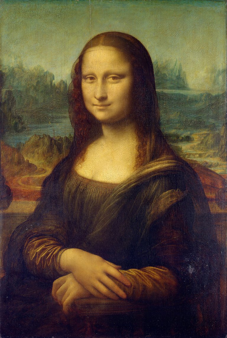
Mona Lisa, Leonardo da Vinci, c. 1503–06
Traditional Oil Painting
*White
Zinc white
Flake white
Titainum oxide
*Black
Ivory black
Mars black
*Red
Cadmium red light
Light red
Indian red
Mars red
Cadmium red medium
Cadmium red deep
*Blue
Ultramarine blue (all shades)
Cobalt blue
Cerulean blue
Manganese blue
*Green
Viridian
Chromium oxide green
Green earth
Colbalt green
*Yellow
Cadmium yellow light
Cadmium yellow medium
Cadmium yellow deep
Cadmium orange
Naples yellow
Mars yellow
Yellow ochre
Raw sienna
Cobalt yellow
Hansa yellow
*Violet
Cobalt violet
Manganese violet
Mars violet
*Brown
Raw umber
Burnt umber
Burnt sienna
Mars brown
Green earth and cobalt violet have low tinctorial power making them much more useful as a glaze color than an opaque color. The imitation cobalt blues are just as permanent and share a lot of the same properties with ultramarine blue. Both flake white and Naples yellow contain lead, extra cleanliness precautions are to be taken to avoid lead poisoning. Though these two hues are so highly desired they are used despite the disadvantages. Indian red has a bluish or rose undertone, and light red is comparatively yellowish or salmon undertone. These two products should be used in place of native earth reds, all of which are inferior.
![Juramento%20dos%20Horácios,%20David,%20%201784_thumb[3].jpg](https://images.hive.blog/768x0/https://steemitimages.com/DQmVb4dmTRVpwUbRSi5Wh6AETxecooWm5dQ3PoFseTZkcic/Juramento%2520dos%2520Hor%C3%A1cios%2C%2520David%2C%2520%25201784_thumb%5B3%5D.jpg)
Juramento dos Horácios, David, 1784
Traditional Watercolor
*white
Chinese white
Titainum oxide
*Black
Ivory black
Mars black
*Red
Cadmium red light
Light red
Indian red
Mars red
Cadmium red medium
Cadmium red deep
*Blue
Ultramarine blue (all shades)
Cobalt blue
Cerulean blue
Manganese blue
*Green
Viridian
Chromium oxide green
Green earth
Colbalt green
*Yellow
Cadmium yellow light
Cadmium yellow medium
Cadmium yellow deep
Cadmium orange
Naples yellow
Mars yellow
Yellow ochre
Raw sienna
Cobalt yellow
*Violet
Cobalt violet
Manganese violet
Mars violet
*Brown
Raw umber
Burnt umber
Burnt sienna
Mars brown
The weak or low tinctorial permanent colors can better be utilized in watercolors than in oils. I've played with Payne's gray before, many artists in all mediums love this color. Its viewed as a useful and convenient thing to have on the palette. While others find it unnecessary, personally I just have to say that if you haven't given it a try you should. The color from the tube has a really good look on the canvas, and it makes a great mixing color. For gouache (opaque or impasto watercolor) you will see the same general palette in use, but when used full strength the transparent pigments will function as body colors and exhibit their tones. Their undertones can be brought to surface by adding considerable amounts of whites. Watercolors are not void of harmful affects, it should be noted that you shouldn't moisten the brushes with your mouth. Special care should be taken when selecting pigments for children.
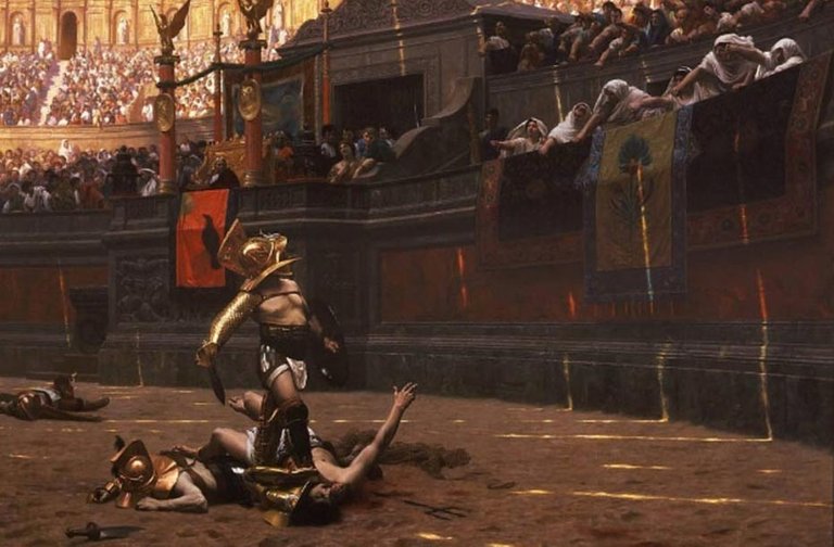
Jean-Léon Gérôme's 1872.
Traditional Tempera Painting
The palette in use for tempera are the same as oil painting except that no pigment containing lead may be used if the painting is to be completely tempera without oil or varnish glazes. Flake white and Naples yellow may be used if you plan to varnish. In most tempera titanium is superior to lead or zinc, it shows none of the faults commonly seen in oil painting. The extremely powerful tinting strength of the pure oxides is sometimes awkward, and in some instances the barium composite variety may be preferable.
Traditional Pastel
All the poisonous and the sulfur-sensitive pigments Naples yellow, white lead, cobalts, cadmiums, and manganese, ect. are eliminated from the pastel palette. The dust is considered too poisonous for use. When making one's own crayons great attention should be placed on picking only the strongest and highest quality colors. During tests a focus on brilliancy and dryness should be established. The most common white in use is precipitated chalk. French chalk has also found its use on some palettes for its smooth and soapy texture. While the most poisonous compounds have been eliminated it still must be said breathing in dust of any kind can have negative affects to your health.
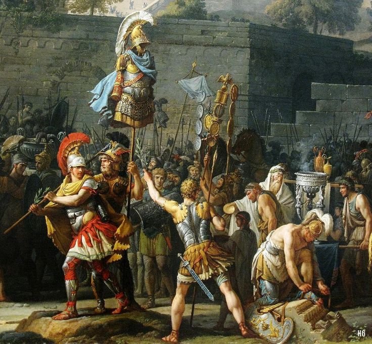
Carle Vernet, French Metropolitan Museum of Art
Japanese Pigments
These pastel pigments have remained unchanged for centuries.
*White
Ground quartz
Ground calcite
Shell white
Mica
*Blue
Powdered azurite
Very finely powdered azurite
Japanese indigo
*Green
Malachite
*Bluish green
Azurite and malachite mix
Malachite rich
Burnt azurite and malachite
Azurite rich
*Red
Pure vermilion
"Red" (hon shu goku akakuchi)
Cochineal red
Cochineal crimson
Red lean
Red earth color
yellow earth
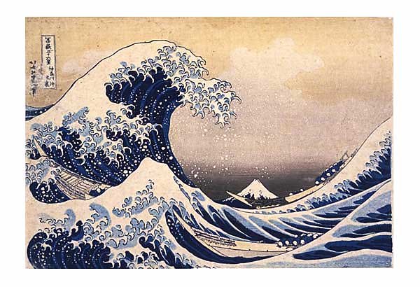
View through waves off the coast of Kanagawa, KATSUSHIKA HOKUSAI
Fresco Painting
There is still research to be done on the materials for a solid list to be made. Fresco painting has many more restrictions to the palette than any other. The pigments chosen must not only be lightproof, but must resist the alkaline action of the lime plaster and acidic pollution in the air.
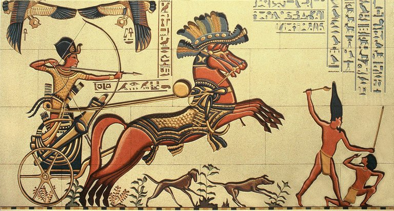
Cleopatra Egyptian mural
Traditional Fresco Palettes
Egyptian Mural Painting
*Black
Carbon
*Blue
Azurite and Egyptian blue frit
*Brown
Various native earths
*Green
Malachite and crysocolla
*Red
Native red oxides
*White
Chalk and gypsum
*Yellow
Ochre and native orpiment
Minoan Fresco
*White
Lime putty
*Black
Powdered slate
*Red
Native red Oxide
*Blue
Egyptian blue frit
*Green
Mixtures of blue, black, and yellow
*Yellow
Ochre
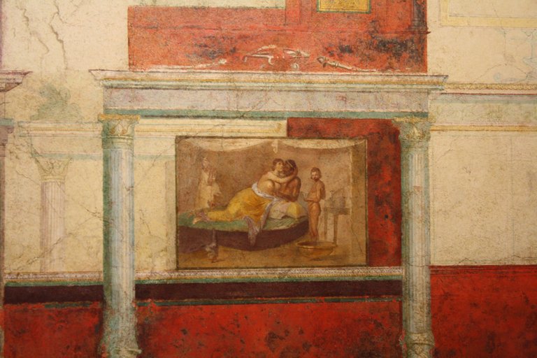
Villa of the Farnesina, Rome
Roman Fresco
*Black
Lampblack
Possibly also bone black
*Blue
Egyptian blue
Possibly copper ores
*Brown
Native earths
*Green
Egyptian green
Green earth
*White
Lime
*Yellow
Ochres
*Red
Native oxides
Pozzuoli red
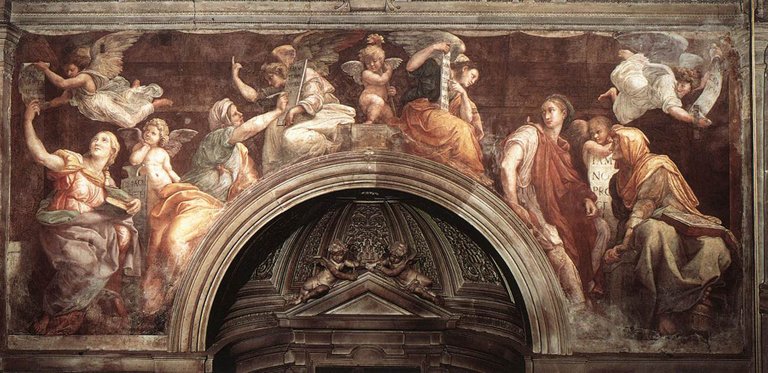
Raphael Sanzio (Italian: Raffaello) (1483 - 1520) Sibyls Fresco, 1514
Traditional Italian Fresco
*White
Bianco sangiovanni
*Black
Lampblack
*Red
Native Venetian red or Spanish red
Pozzuoli red and other native red oxides
Burnt sienna
Vermilion when applied secco
*Blue
Egyptian blue
Azurite
Smalt
Native ultramarine when applied secco
*Green
Green earth
Mixtures of blue and yellow
*Yellow
Ochre
Raw sienna
*Brown
Raw umber
Burnt umber
Burnt green earth
Modern Fresco
*White
Slaked lime putty
Bianco sangiovanni
Neutral blanc fixe
*Black
Mars black
Lamp black
*Red
Several shades of red oxides
Mars red
Indian red
Light red
Burnt sienna
*Blue
True cobalt blue
Cerulean blue
*Green
Viridian
Chromium oxide green
Cobalt green
Green earth
*Yellow
Mars yellow
Yellow ochre
Raw sienna
*Violet
Cobalt violet
Mars violet
*Brown
Raw umber
Burnt Umber
Mars brown
Fresco Pigments Selected for Permanence
*White
Blanc fixe
*Black
Mars black
*Red
Indian red
*Blue
Cobalt blue
Cerulean blue
*Green
Chromium oxide green
Viridian
*Yellow
Mars yellow
*Violet
Mars violet
It has been the practice from an early date of fresco painters to plaster a test panel and subject new pigments to a test of their suitability. Six months exposure is considered enough time to determine if the new material is limeproof.
Hope this helps, if it does don't forget to smash that upvote button. You'll have to let me know you did down in the comments so I can check out your page to.
Ok that one has my wrists cramping up, I'll have to call it there for the day. Tomorrow we will get into some of the properties of these pigments and why they are chosen as a suggested choice.
If your an artists feel free to get yourself involved in my Weekly Sketch Contest
https://steemit.com/art/@dcrockete/2nd-weekly-sketch-contest
Interesting post. I use just three colours + white (yellow ochre, Ultramarine and crimson).
I'm scared to overcomplicate things by adding more colours plus I love the act of mixing and trying to match what I see.
That's really all you need, referred to as limited palette. Will be going more into this on a post tommorow. Mixing your own colors is really fun, I just end up waisting more than I use ;). With more practice I'm sure I'd get better at it. There are a few options you should consider adding, not necessarily as an every time thing, magnesium violet and phthalo blue. The violet makes for a great shadow mixer and the phthalo transitions into that blueish green much smoother than ultramarine. My personal opinion ;)
I don't waste too much paint with the mixing but I do with the paint (acrylic) drying on the palette before I get a chance to use it. The only down side. I'm ordering tubes of those 2 colours - particularly interested to see how the blue performs. Cheers.
Yeah, that was one of the main reasons I switch to oils. Could be weeks before it's dry lol
Wow, this is so fascinating. Thanks for This, I was actually going to paint a ballerina and you post helped me with the colour combinations.
Awesome!! Glad I could be of some help.
Death by paint! Good article. I will vote and follow.
Definitely a hazardous hobby lol. Thanks, plenty more to come.
awesome collections...great art and thanks for sharing
Thank you, it was my pleasure
Very Good...As a health lover read up my latest post on "How to Treat Ear Problems with Natural Remedies"!
support and comment also. thanks
https://steemit.com/health/@kenhudoy/how-to-treat-ear-problems-with-natural-remedies
See your post mentioned here
WOW this is really good, Will be looking forward to your posts.
Up-voted :-)
RightWithin
thanks, working really hard on these. Seems like everyone is really enjoying them, really helping to motivate me to make them even better :)
oh yeah, please keep at it :)
This post received a 4.8% upvote from @randowhale thanks to @dcrockete! For more information, click here!