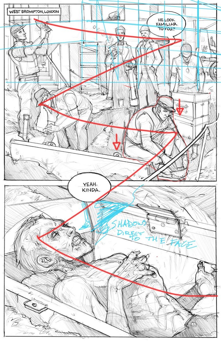
Ok, I'll break down what I see, and maybe it will help. You have a great "Z" shaped read on the page overall which is awesome and you obviously did that purposefully. To help with that, you could do a couple of things.
- Maybe moving the right guy in the foreground lower in the panel to further help the eye flow would be helpful.
- Adding a foreground element in the bottom right like a rope fence or a wire or what ever to direct the eye toward the text bubble would help too.
- The perspective in the first panel is a little flat, especially with the main building. Bringing the right vanishing point closer to the panel will give you a less flat look. It almost looks like the building is super far a way like it was shot with a telephoto lens. That new perspective will also help add to your already sick composition.
- Lastly, you may want to add some shadows or render lines the coffin to, again, make it abundantly clear to the subconscious reader where the eye should go.
Didn't think my explanation was good enough so I did this paint over.

These are all things that might help, but at the same time maybe you have reasons for it to be as is. Either way, awesome job, hope to see more pages soon.