There are two type of card
1.Vertical card
2.Horizontal card
But For today I'm now presenting you "How to make vertical business or organizational card"
Let me show you what today we have to make
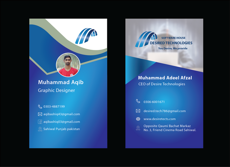
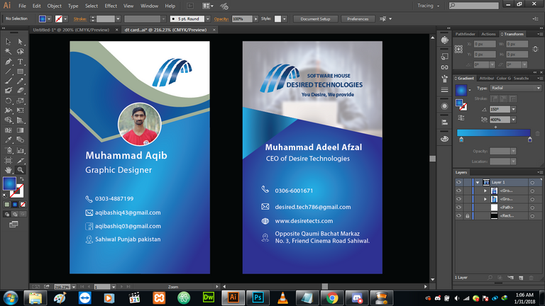
This is a vertical double-sided card that I have made for your Desire channel and the Desire Technologies software house.
Let Start it in illustrator
Open illustrator new page and set the size of page ''3.75 inches height and 2.25 inches width and then add 0.125 bleed points for top, bottom, left, right, and color Mode CMYK''
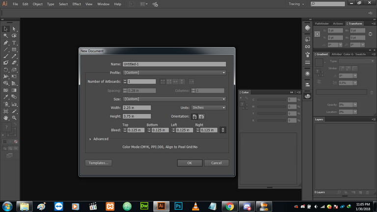
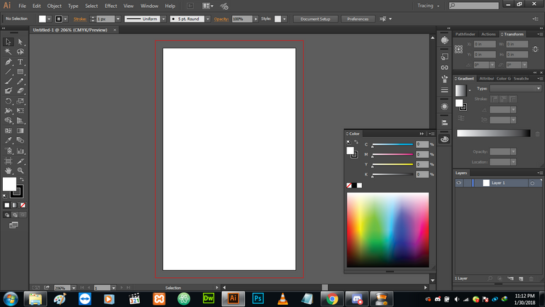
Now this will appears which we say that as artboard
Now make a save box of 3.5 inches height and 2 inches width which we called the save zone.
The Name of save box is given because when the trimmer cut at bleeding points our design content must not be disturb so you must design in between that save box
Lets have a look
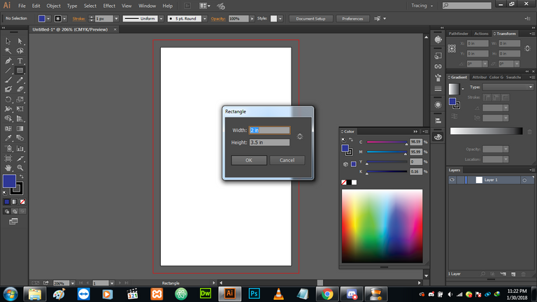
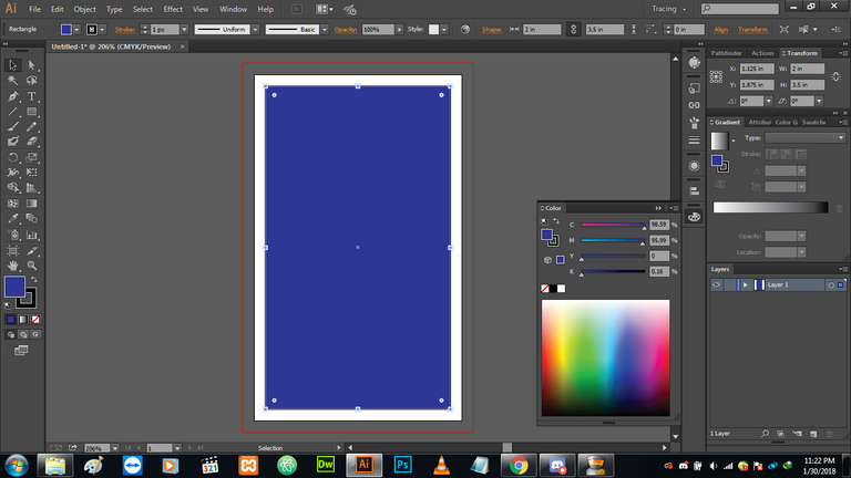
Now I just change its color into white and fill its stroke with black as you see.
My next step is to place the logo of company , brand, organization for which I have made it
Here is the logo of desire
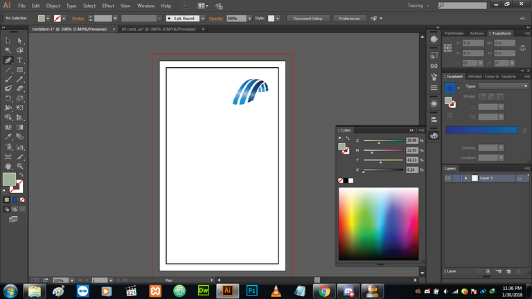
After placing the logo making some style to make it eye-catching by use pen tool as you can see,
Here is the pen symbol on the screen that indicates now i'm using the pen tool at the moment.
After it Now I take one of my pictures and then place then picture from my gallery I take one circle and then using a clip and make to fit my picture in the circle and fill its stroke into white color.
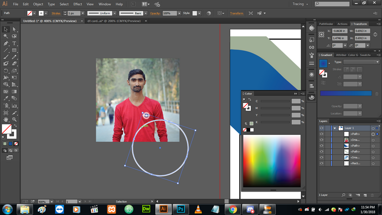
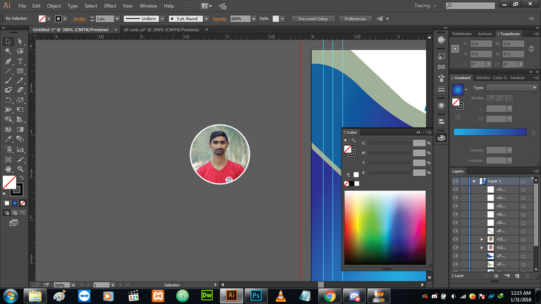
You can see how the image is gonna clip in the circle.
For clip in mask you place the photo below to the shape where you want to clip in and then select it with Shift and then right-click or the egde of photo and click on clip in mask option then it's happens
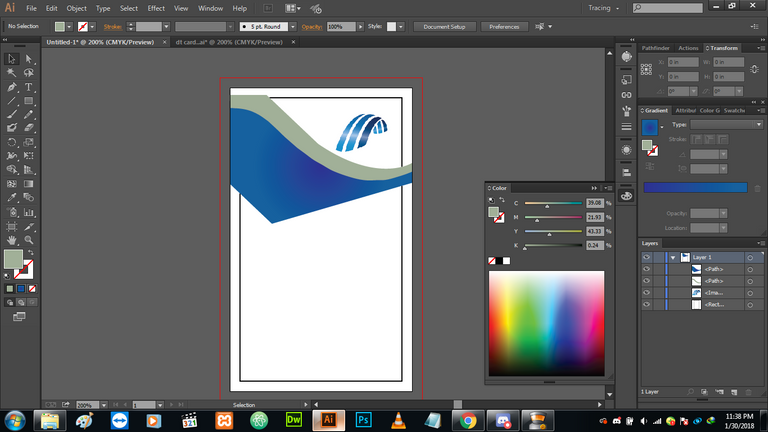
After it making its body style by gradient color use at redial 400 % and angle 152 %
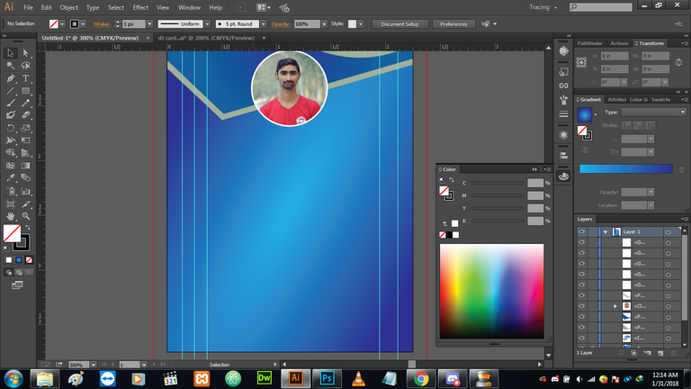
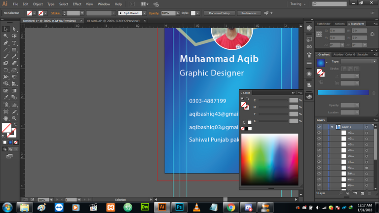
Now Text information in write as required
You can see as the guides are in the alignment of text
The name and graphics are 10 to 12 px in size you must take and the other text will be in between 6 to 8 px
Now take Icon from flaticon as required
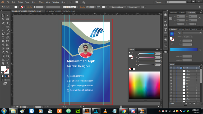
Now you can see one side of card in done so now you have to just copy it by alt and then drag it beside it simply
Now in the same fashion goes on changing as you like on the other side. Now one thing more to make it awesome
Placing one coding person image to make it cool and then make its capacity less to adjust it.
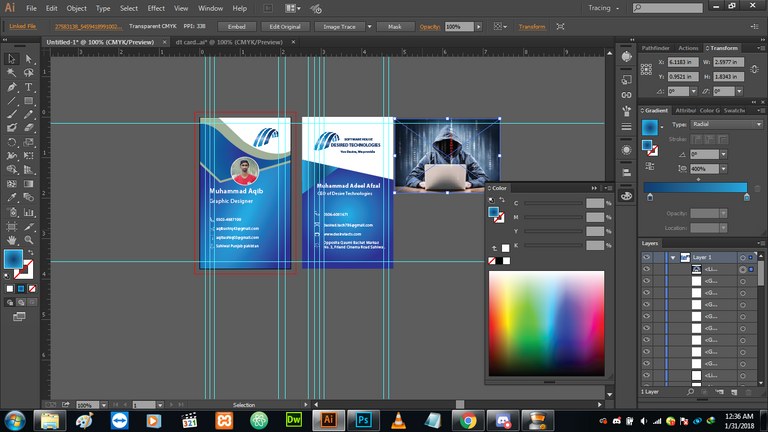
Place the image there and then embed it
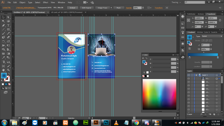
low their capacity about 30 you can see the logo and text will appear and now we have done it to make complete double side card
Special thanks for motivation Steem Education Initivate @cryptokraze @Qasimwaqar @adsactly @techblogger and some inspiration and motivation from @velimir
Please share your important feedback about so that I will make these type of interesting tutorial for you guys :)
Regards : Aqib Ashiq
Ah, this is great work @aqib-ashiq. Resteeming for visibility
Tip!
Great to see your support, specially resteem part.
I am also ashiq friend. Visit my blogs I write about crypto and travel.
thank you so much guys
Congratulations ! @aqib-ashiq, Your post has been selected as #postoftheday by #SEI
Join us in our Discord channel and post in our post promotion page. Dont' forget to use tags #sei or #steemeducate and #adsactly.
yeah sure I already used these tags but I still remember it
Genuinely good work! Lovely to see fellow Pakistani putting an amazing effort. I am impressed. Keep going!
Loved to see your support to SEI students.
sure sir I'm always with you
thanks sir for your support and motivation
hummm.. amazing work. keep sharing such valuable designing work.
thanks big bro special thanks for such awesome guidline <3
Hi @aqib-ashiq! You have received 0.1 SBD tip + 0.03 SBD @tipU from @princessmewmew :)
Tipuvote! - upvote any post with with 2.5 x profit :)
thank you so much for great motivation and support
Good work .
thanks sister
Great Design Work! I love clean design. Most designers do too much. The standard size over here in the U.S. is 3.5 x 2. The safe zone would be 3.25 x 1.75 in that case over here. I've been in printing for 17 years and I appreciate you showing the bleed in your art. That one simple thing is what most designers wont even consider. (bleed is the area of the design that is literally cut off in production)
thanks man <3 for your great motivation and support
Nice brother good work
thanks bro
Mind-blowing work keep it up bro @aqib-ashiq
thanks bro
Good art
thanks bro
Lovely post.