CONCEPT AND WORKFLOW FOR SPEAKEASY BAR
(everything i share about this work was made by me)

Hi everyone, i want to share with you an idea of graphic design process, from the concept to final work, hope this "tutorial" will be interesting and helpful.
(forgive my english)
FIRST STEP
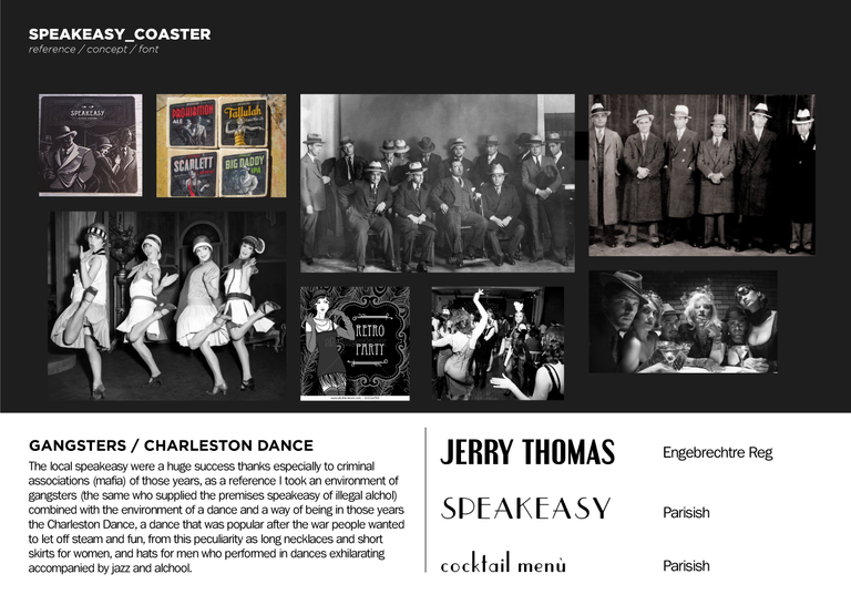
Most important step imo, the moodboard, the concept of your work and style, i usually work like this:
- search reference
- choose better font for the brief
- explain your choices

SECOND STEP
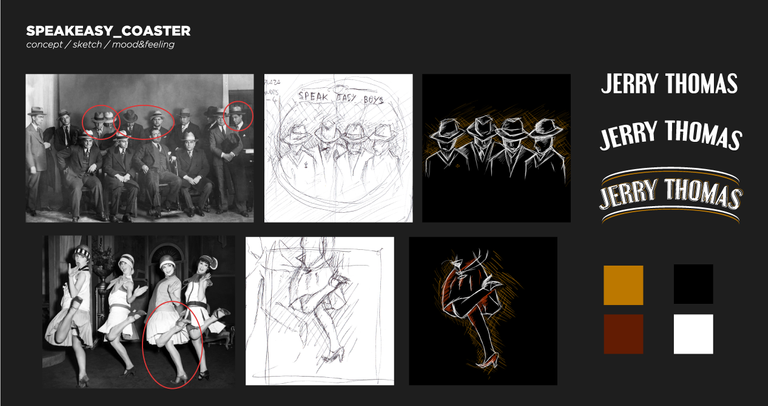
Start your workflow, i usually do sketched then i digital back to insert in the layout, i usually work in this order:
- doin sketches on sheet
- digitalize it(usually photoshop)
- style it, with nice mood and you ready to put your concept in the final work

THIRD STEP
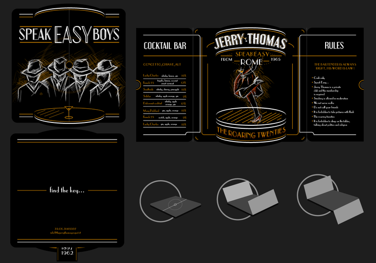
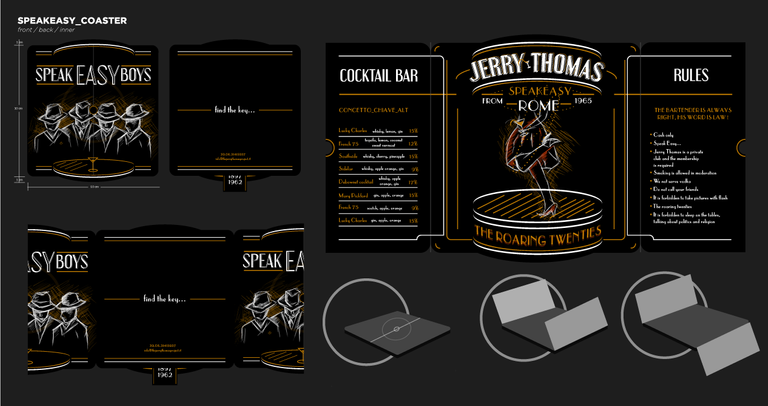
The funniest and creative step, the final, where you can show your style, colors and everything together i just suggest to take care about:
- feeling and mood of style
- style must eyecatching and coherent with the concept
- do a final mokup to show your comissioner about how will be the work printed on coaster (in this case)

I really hope that this guide will be helpful to someone, specially new people that want approach to graphic design
please give me feedback about what u think, have nice day. and goodluck!