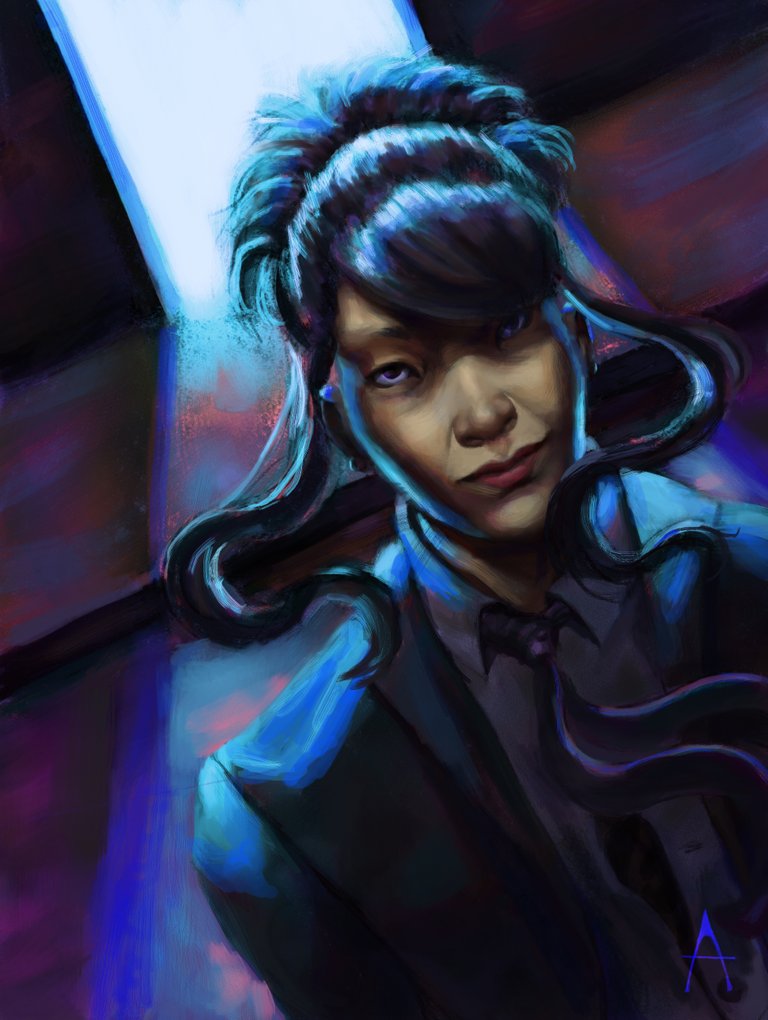
Today we'll be talking about the process of doing this image:

First of all, I recorded myself painting the video and put together a speedpaint of this image. I definitely recommend reading this tutorial as you watch the video, though it is not necessary. Check it out and if you like it, leave an upvote there, too!
My workflow tends to vary, as I'm in a process where I'm constantly exploring new things and picking up what makes me the most comfortable, but for this video, we can easily break down in four parts: sketching and lines, blocking, and two parts of rendering.
Sketching and Lines
I made a very rough sketch with a big brush, just to serve as landmarks for the shapes and where I check the composition. This is extra important in this specific painting for one single reason: I didn't work out thumbnails. It's something that I definitely should've done and ever since then applied it successfully. I break down and detail the shapes smaller brushes more and more, until they are very thin lines. Something I’ve heard and that it reached out to me was to make every piece a study, and I tried to be as careful as I could in the thinnest of lines, to train draftsmanship.
Since I work on Krita, I can definitely point out that a huge help for lineart it's the assistant tool from the brush stabilizer docker. I use them in the background to draw straight lines, but there's an assortment of different things you can do, such as vanishing points, ellipses etc.. You can also see I made windows that barely show on the canvas, but I’ll end up removing them because they didn’t add to the painting or serve any purpose.
Blocking
With the background easily colored with the fill tool, as I keep separate layers for the lines, next thing I do is to block the shadows according to where I visualized the key and fill light sources. As I envisioned it, the biggest light source is a backlight, like a heavily lit room. The rest of the painting would suggest a night scene, with streetlights illuminating the character's face. For now, though, I express only with shadows, where I paint them a dark blue to help with the mood.
The next step is coloring over the shadows with a layer set to the blending mode Overlay. Overlay is helpful in this case because if you pick the right color, then it also alters the local value of the things you're painting. That's how I don't need to worry about the value of the skin or the suit; of course, there'll be further adjustments in rendering, but it's a very strong base.
In the video you'll see I started making cast shadows, but things REALLY pop out when I paint the backlight with a Color Dodge layer. One important thing about backlight is that backlight is not a line behind the character. Backlight fills up shapes and you need to make sure it does. Making just a thin line tends to be a very common mistake, so whenever you're painting it, always think about the planes of the objects. And taking the opportunity to add something else: not all materials reflect light in the same way, so you want to take it down a notch on different ones.
Rendering, pt. 1
I start constructing the mood and that’s where I also start to make changes, something the thumbnails would optimize. I start changing the color of the light source and I’m not sure about the color palette yet, something that actually takes my attention off the rendering. Starting the proper rendering, I add color accents so things pop out more, making it more colorful, more resonating with my style. Mix brushes are great for certain areas, because they preserve saturation when mixing the colors, while adding the original color a bit, too. In the rendering of the face, my aim was to make it still have the painterly feel, while still preserving some realism, and going on with the color adding, especially there because the face is the focus of the illustration, and even on shadows you can see there is a detail, even if feint.
Still talking about the planes of the objects, when you think of it that way (as many artists would say, "paint like a sculptor"), you can easily simplify everything into masses of shadow and light and create the illusion of volume. This is how the rendering follows up. I also flip the image every once in a while to guarantee things aren’t off, and to reset my vision; getting your eyes used to a painting while in process is the best way to make your brain ignore all the mistakes. You’ll see there’s a point where I’m thinking the contrast on the face is too weak, and I add a big puddle of a light, warm color; it leaves a nice blank slate for me to work the face as I want, but it also means I need to re-render the face.
Rendering, pt. 2
Towards the end I come to the conclusion that the palette is a little all over the place, and decide the red should be kept only as accents, so I change the light source to a teal color with a Color HSV layer; and to those who use other painting programs, Krita has a huge amount of blending modes, with some sets according to different color systems, so Color HSV does something different than Color HSL (and it really does). That big change makes me satisfied with the palette, and I take a final run in the video to render things, fix what I’ve done to the face, add a blue fill light because it’s a night scene and have a value check to fix some areas under a composition point of view.
The final adjustments aren't shown in the video because those are made a while after these sessions, where my eyes aren't used to the painting anymore and I can see the mistakes I made. I extend the cast shadow of the wall to make it look like an actual building and to narrow the focus of the painting towards the character. I render the face a little more. I also harmonize the color palette and add even more color accents.
Done! Here's the image, again, for your scrolling conveniences:

Every painting you make, you learn something new, and here's what I've learned through the process of this painting:
- Plan your paintings! Thumbnails and planning is worth it because it cuts significant amounts of the time of frustrating work and rework;
- Even if the background is not an elaborated one, it is still important;
- Reference and studies would've solved the fill light problem, and this could've been an even more believable night scene;
- Color accents really makes the image interesting.
I hope you could learn something from this!