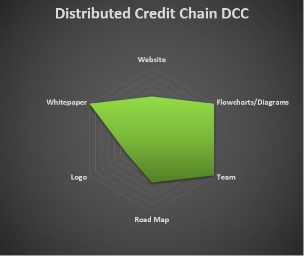
Here is a quick look at Distributed Credit Chain. A snapshot of the marketing, branding, and professionalism of the DCC project may lead to further investigation. Regardless of my personal opinions, do your own research.
🚩 Website
Slow to load, looks cobbled together
No typography considerations
Concepts not scenarios (images)
Phrasing is uninspiring
🔑 Flowcharts/Diagrams
Vivid and informative
🔑 Team
More-info hovers
LinkedIn
Diverse
🔑 Whitepaper
Structurally sound
Show and tell diagrams
Comprehensive
🚩 Logo
Gradient color
Appears contradictory (weakest link)
2D
Ambiguous
🚧 Road Map
o Needs progress/accomplishment indicators
o Alignment off
