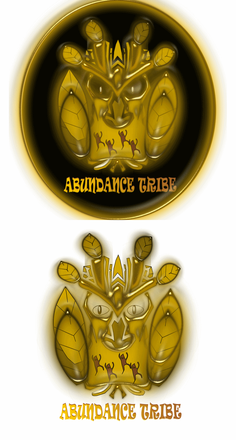
As stated in my previous article about the New Custom Abundance.Tribe Page SeparatorAbundance.Trbe Logo Design Contest by @LisbethSeijas - I have been working behind the scene with the 1st & 2nd place artists from the (@capitanzek & @lisbethseijas) to modify and enhance some of the elements in their winning designs.
wind. My original request in the contest entry article stated that I would like participating artists to keep professionalism as a footnote in their minds during design creation, and also to keep humanitarianism, environmentalism, and elements of the elemental at the forefront of their designs.While @CapitanZek's design overwhelmingly took 1st place in our contest, I still saw potential design inclusions that could severely enhance the logo, and further distinguish it from the @NaturalMedicine logo. The first aspect I noticed was missing from the design was the element of
Winner's Announcement Post:I and others saw this symbol as a fantastic blend of professionalism and elemental forces. This is what I had to say about @CapitanZek's 1st prize logo in the
"Using a symbol that is reminiscent of the @NaturalMedicine logo (to a degree) is actually appropriate as AT & NM are certainly allies with overlapping values and members. This design is professional, while still holding elements of the elemental with fire (sun), water, Earth, life, and the lotus flower growing from the roots of infinity is a tasteful inclusion. I believe the wind element could be easily implemented into this design with some circular rotation around the outer edge of the logo, and should provide a little more contrast from the natural medicine logo by possibly updating and enhancing both logos for each respective community. I am also a huge fan of the mirror-reflecting font and the three water bubble droplets above the flower tip."
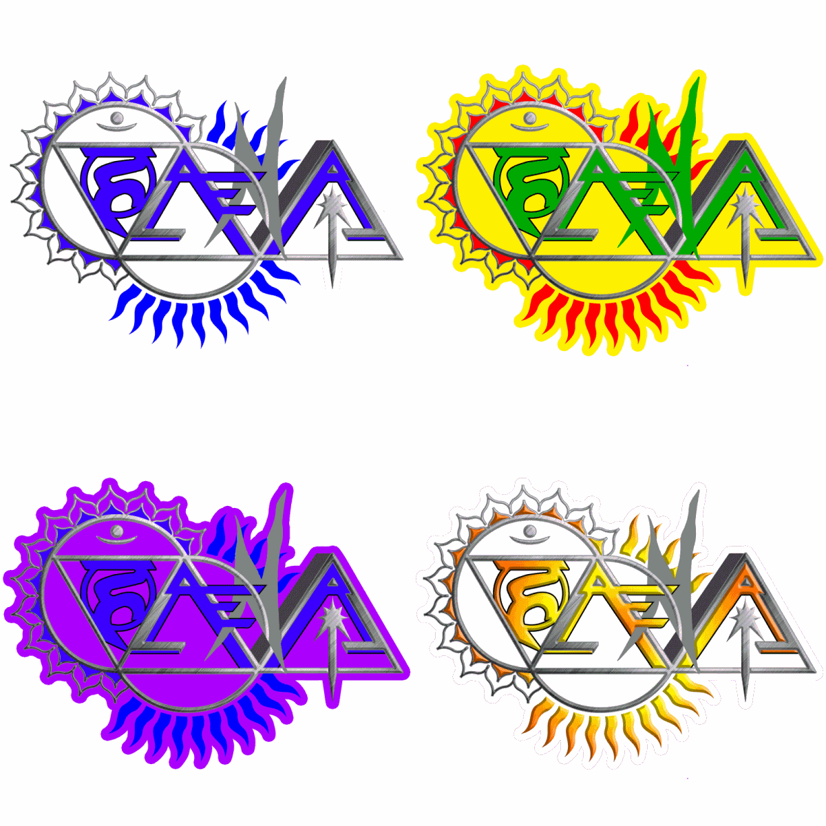
While implementing the wind element was a fairly easy task, I also realized that one of the other elements that was missing was spirit. To accommodate for this, I had @CapitanZek implement chakra points into the design. The first three points at the top (Sahasrara, Ajna, & Vissudha) also represents the water that feeds the lotus flower (Earth element), which is why they are all blue (those three chakras all fall on the blue end of the color spectrum anyway). The bottom four chakra points (Anahata, Manipura, Swadhisthana, & Muladhara) all correspond to the correct color for each of those chakras.
With all 7 chakra points represented with circular designs, there is also an eighth circle - the sun (fire element), which completes the circuit to connect symbolism representing the 8 Pillars of @TribeSteemUp (our community's core values), along with all the elements of nature and life.
Final Edit of @CapitanZek's 1st Prize @Abundance.Tribe Logo
New Ideas
I must admit that I was tempted to include a heart as the Anahata chakra point instead of a circle to represent the "love" element, but decided that would detract from the fact that one of the goals here is to distinguish this logo from the #naturalmedicine symbol, not make it more similar.
Looking for Support
I am still looking for a graphic designer to help enhance and distinguish the @NaturalMedicine logo as well. Comment below or shoot me a dm on Discord if you are interested and think you can help with this mission. I am also in need of someone to help create a page separator and banner with this new @Abundance.Tribe design.
to host a cannabis themed logo contestanimatorDiscord, or comment below.Additionally - I would like to offer my assistance to our #Canna-Curate community . I would like to see an alternate @canna-Curate logo crafted with a similar structure to these logos, only using a cannabis leaf instead of lotus flower. If this could be accomplished in a distinctively unique way (apart from the design elements found here) and we found the right graphics animator, we could make one really pro-looking fade-transitioning GIF with the three logos, from these ever-intertwined communities. If you would like to be a sponsor for this contest or are a graphics that would like to help, please contact myself or @Jonyoudyer on
I hope all you @Abundance.Tribe members (and everyone who appreciates creative/insightful logos) enjoys this enhanced logo design I helped manifest with @CapitanZek. Use it freely with your blog posts, and please let us know if you have any further ideas about any of this.



Click here to hear my single: Shift the Focus on Soundcloud from my upcoming album: Power of Truth
Click here to hear my un-mastered sample of No Consent
My debut conscious Hip-Hop album The Hex Wrecker is completely free for download on Bandcamp & Soundcloud (click the links to go to my music on those platforms), or CLICK HERE for download instructions.
Awesome. Thanks for getting this done. And congrats again to @CapitanZek for his most deserved win.
Thanks
I do my best to harness maximum creative implementation.
Wow still so much work going on behind the scenes. It's all coming together though. Great job.
They are on a colored background, rather than transparent? A transparent background will allow us to customize it a bit easier individually.
The night mode version is transparent isn't it? I also have the AI file if you need it. LMK how I can help get what you need. Although I know a lot of graphic designers, I am not one myself - wish I knew how to do some of these thing. I am slowly learning however.
Thanks @elamental for this great post.
Thank you for all your help with the edits... I know it was a lot.
I think the upgrades to the design looks great! You have some clever ideas.
Thanks bro, I try to keep em comin'.
here.
Curated for #naturalmedicine (by @porters) - join our community Oh! I like it! And to me it is quite distinguishable from the NM logo. Well done @CapitanZek!
We encourage content about health & wellness - body, mind, soul and earth. We are an inclusive community with two basic rules: Proof of Heart (kindness prevails) & Proof of Brain (original content). Read more here.
Our website also rewards with its own Lotus token & we'd love you to join our community in Discordhere. Delegate to @naturalmedicine & be supported with upvotes, reblog, tips, writing inspiration challenges for a chance to win HIVE and more. Click to join the #naturalmedicine curation trail!
mostThank you for the support @Porters. I know different members favor different designs, but with this logo (and artist) being the favored in the contest, I hope these modifications are sufficient to satisfy @RiverFlows - her approval on this is most important to me. I do not want anyone in our community to feel like their opinion doesn't matter (bc I know what that feels like), & I really do care how everyone feels about this. Hopefully she will have some ideas for an enhanced alternate NM logo as well, although I have always loved the simplicity of the original design - but I have also always had an aptitude for creating alternatives, so I feel called to assist with this if it is desired. I personally love what this version of the @Abundance.Tribe morphed into. Blessings!