These days have been a lot stressful because of a lot of school works and catching up with the deadline is a must. I had a free time this day so I thought of sparing some time to blog. I was supposed to add another entry for my series " Minecraft Creations" but that takes a lot of time including the creation of the structure and formatting my blog and the write-ups so I opted to share how I format my blogs. I also searched several markdown codes that are necessary for the blogs.
Not to brag but I have been receiving a lot of compliments about how cool my blog layout is, so I decided to share to you all how I format my blogs. No one did ask for it but let me just share it anyway.
Other than having a good substance of your content, one way of attracting readers is the way of how you format your blogs. Making your blogs presentable attracts the eye and thus, you could gather a lot of people to read your blogs.
Other thing is that it makes your posts more organized and you could somehow emphasize the very important or crucial information that you are referring to your content.
If you wanted to gather more sources of information, kindly click the hyperlinks below.
- Markdown Cheatsheet by Adam Prichard (2017)
- Mastering Markdown by Github (2014)
- Formatting your Steemit posts using HTML markup by @johnrhytnmic(2017)
It is up to you what markup you would use whether HTML or Markdown but for the following guide ,I am mostly using HTML because I am more comfortable using it.



|

|
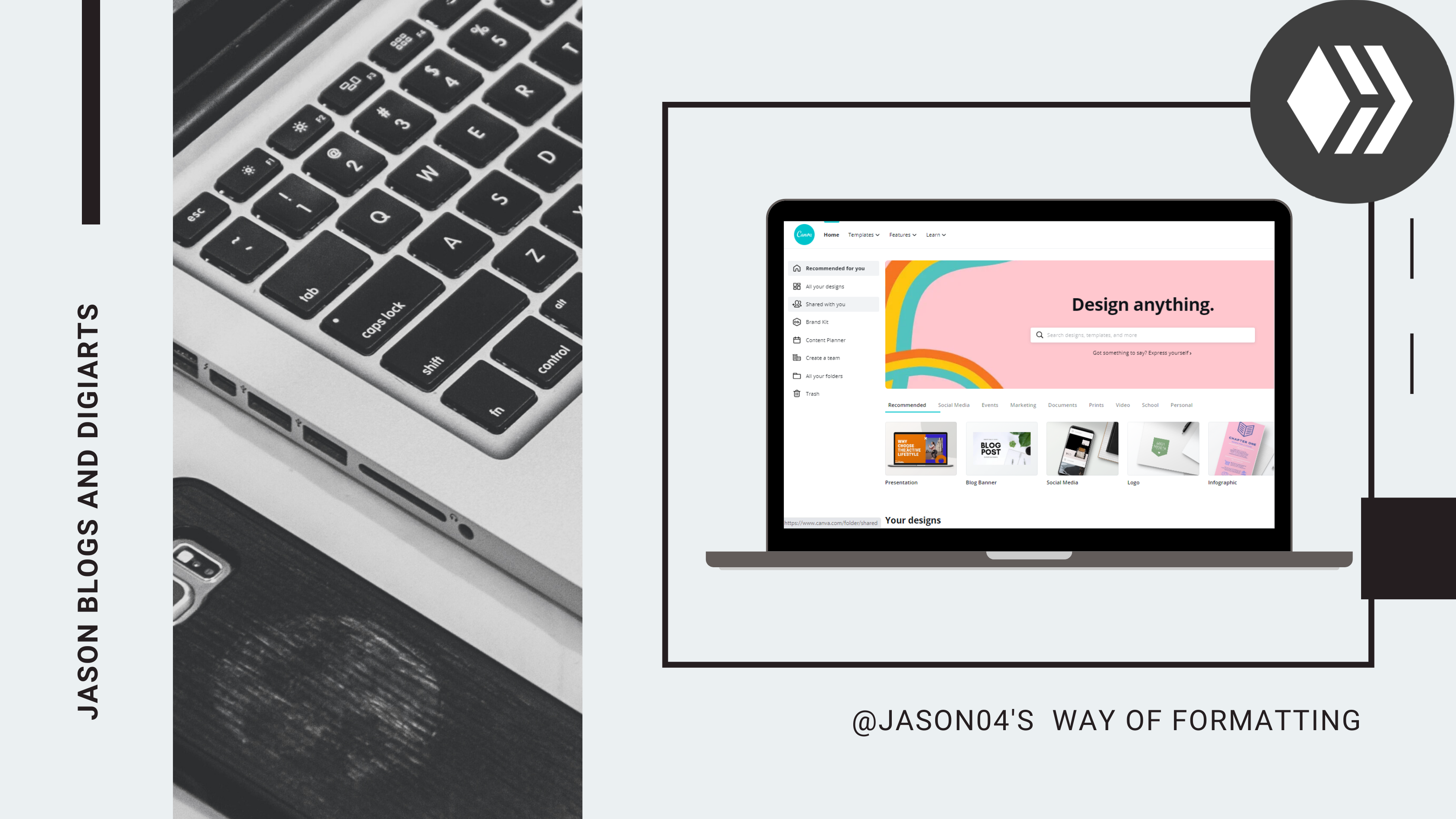
If ever you wanted to make one, first thing that you should do is to choose a template or create a blank page with a custom dimensions(you could still use a template with your blank page). Next is to do your blog thumbnail (make it simple but elegant).
After finishing all edits and revisions to your blog thumbnail, duplicate the page and set the animation time for the first page to 0.1 s with no animation. This is because the first thing that the blog preview would show is the very first frame or image of the gif. Then set the second page to your desired length of animation time and as well as choose the kind of animation that you want
Lastly, save the your thumbnail as a GIF and upload it to your draft.
Anyway, this is just my suggestion or my style. You could still stick to your own preference though. I just find it fun to do and I also love how it makes my blog attractive.

Text Headings
Here are like 6 main header sizes and here is the code:
<h1>Heading 1</h1>
<h2>Heading 2</h2>
<h3>Heading 3</h3>
<h4>Heading 4</h4>
<h5>Heading 5</h5>
<h6>Heading 6</h6>
Here is how it looks:
Heading 1
Heading 2
Heading 3
Heading 4
Heading 5
Heading 6
Image Headings
Dimensions : 1625 x 320 (my recommended size or higher provided that you follow the aspect ratio) and you could also change the height and the width if you would like to. I recommend higher px for higher quality
Syntax: If you already had the image with 325 x 64 size or close to that ratio, it is good to go. But if you had the image on a higher size (width that is like 120 up), follow the code "https://images.hive.blog/325x55/ and insert here the imagelink. You could also change the length and width depending on your preference."
Here is the code:
https://images.hive.blog/325x55/https://images.hive.blog/DQmUN6uL4SDQDL2iA1JeTFeQGnZRUKpM7J6JYCE7CYbxxaf/Copy%20of%201.png
Here is how it looks:
.png)
.png)


Next thing is formatting your text including the text alignment and text empahsis -such as bold ,italic, etc.
Alignment
Align Left
In default, your text will always be aligned left.
Here is the code:
<div class="text-left">This Text is aligned to the left.</div>Here is how it looks:
This Text is aligned to the leftAlign Center
Text that are aligned to the center are mostly captions of your pictures, lyrics of songs and many more.
Here is the code:
<div class="text-center">This Text is aligned to the center</div>Here is how it looks:
This Text is aligned to the center.Align Right
Here is the code:
<div class="text-right">This Text is aligned to the right</div>Here is how it looks:
This Text is aligned to the right.Justify
In format compositions, it is always a must to justify your text. And I have been using this alignment in my blogs since it is very neat and clean to see
Here is the code:
<div class="text-justify">This Text is aligned to the justify</div>Here is how it looks:
This Text is justified and to have a better view, I intended to make this long so you could see that it is both aligned to the left and right side. This makes the text very presentable and formal.
Text Emphasis
Bold
Here is the code:
<b>This text is bold.</b>Here is how it looks:
This text is bold.Italic
Here is the code:
<i>This text is italic.</i>Here is how it looks:
This text is italic.Sub
You could use this when putting captions below your picture. I got this idea from @ybanezkim26. Visit also his blog, he's a great one.
Here is the code:
<sub>insert your photo caption</sub>Here is how it looks with a photo(just add the cod for putting text to center):

How to Format your Blog in an Epic Way Blockquote
Here is the code:
<blockquote>This text is in a blockquote.</blockquote>Here is how it looks:
This text is in a blockquote.
Strikethrough
Here is the code:
<strike>This text has a strikethrough.</strike>Here is how it looks:
This text has a strikethrough.

Center
In some instances, your uploaded images may not be at full width with respect to at hive.blog's website width. As a result, your images would be aligned to the left which leaves a gap on the right. This is not good to look and so it is better to pull it to the center.
Here is the code:
<center>insert your image link here </center>Here is how it looks
.png)
Pull-left / Pull-right
Also, there are situations where you have a lot of pictures and you want it to be included in the blog. As a result, your blog looks very crowded with pictures or it looks very lengthy. I recommend to have some of your pictures placed side-by-side.
Here is the code:
<div class="pull-left">insert image link here</div>
<div class="pull-right">insert image link here</div>Here is how it looks
.png)
.png)

Image Hyperlink
Here is the code:
<a href="insert the link to where it is referenced to">insert image link the image name </a>
Example:
<a href="https://hive.blog/hive-174578/@jason04/only-investors-belong-in-hive-or-by-jason04">  </a>
Here is how it looks(click the picture and it takes you to that blog ):
Text Hyperlink
Here is the code:
<a href="insert the link to where it is referenced to">insert text here </a>
Example:
<a href="https://hive.blog/hive-174578/@jason04/only-investors-belong-in-hive-or-by-jason04">Only INVESTORS Belong in HIVE | Investor of Time and Right Effort</a>
Here is how it looks:Only INVESTORS Belong in HIVE | Investor of Time and Right Effort

But for this element I am using the markdown codes because it is much easier than the HTML code for tables.
Here is the code:
Column 1 Title | Column 2 Title
------------ | -------------
Row 2,Column1 Content | Row 2,Column2 Content
Row 3,Column1 Content | Row 3,Column2 Content
Here is how it looks
| Column 1 Title | Column 2 Title |
|---|---|
| Row 2,Column1 Content | Row 2,Column2 Content |
| Row 3,Column1 Content | Row 3,Column2 Content |
Moreover, you could also input pictures to the tables. Sometimes, I used tables as my pictures frames. Like this one:

|

|

Bulleted List
Here is the code(erase the [space] portion of the code and take note of the spaces :
[no space]-[single space] Item A
[two spaces]-[single space] Item A.1
[four spaces]-[single space] Item A.1.1On the main heading of the list, there is no space before the "-" symbol. On the subheading or the content of that heading, you add two spaces before the "-" symbol. And if that subheading contains another subheading, you add four spaces and so on.
Also remember that every after the "-" symbol, there is always a single space or else the list won't work.
Here is how it looks:
- Item A
- Item A.1
- Item A.1.1
- Item A.1
Numbered List
Here is the code(erase the [space] portion of the code and take note of the spaces :
[no space]1.[single space] Item A
[three spaces]a.[single space] Item A.1
[six spaces]a1.[single space] Item A.1.1
- Item A
- Item A.1
- Item A.1.1
- Item A.1

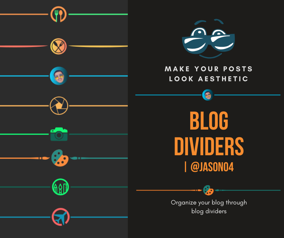
A blog divider or a visual divider is a design component that assists in grouping or dividing the composition into parts that has the same context or topics.
Horizontal Rule
It is used to separate the contents of your blog by adding a horizontal line. But the disadvantage of this one is that it is not visible in night mode of hive.blog.
Here is the code:
<hr>Here is how it looks:
Custom Blog Dividers
I made several custom made blog dividers and if you wanna get one feel free to visit this blog and feel free to contact me

About the Author Statement
Anyway, this about the author section is where you say your ending statement and who you are as a blogger which includes your blog niche, your hobbies and anything about you.
Here is a sample code:
<div class="pull-left">
https://images.hive.blog/400x400/https://images.hive.blog/DQmVPZSXpCxUorKd2jnPKX8k2kiRQoUkX8yLcySMUCdzzQY/dasxza.png
</div>
<div class="text-justify">
<b>Spread Positivity and Keep the Vibes Up!</b>
<p>
<sub>
What's up Hivers ! Give me a Hive Five.......................Nice! This is Chris Jason A. Oswa, your boy @jason04. I am currently a Computer Engineering here in Cebu,Philippines. I am a gamer ever since and if you are too, join me in my blogs. I often do travel to places but sometimes, I just enjoy the moment and I can not take pictures on my travels. Other than that, I also love doing graphics and designs, so if you got some proposals regarding that matter, do not hesistate to contact me. Thanks for dropping by ladies and gents! If you like my blog, I would appreciate it if you upvote and follow me. Also, don't forget to comment and let's have fun in the comments section. See yah next time!
</sub>
</div>
Scroll through the bottommost part of this blog and view my about the author section. You could also visit other peoples blogs especially Filipinos because as what I have observed, most Filipino hivers are having this one.
GIF Footer
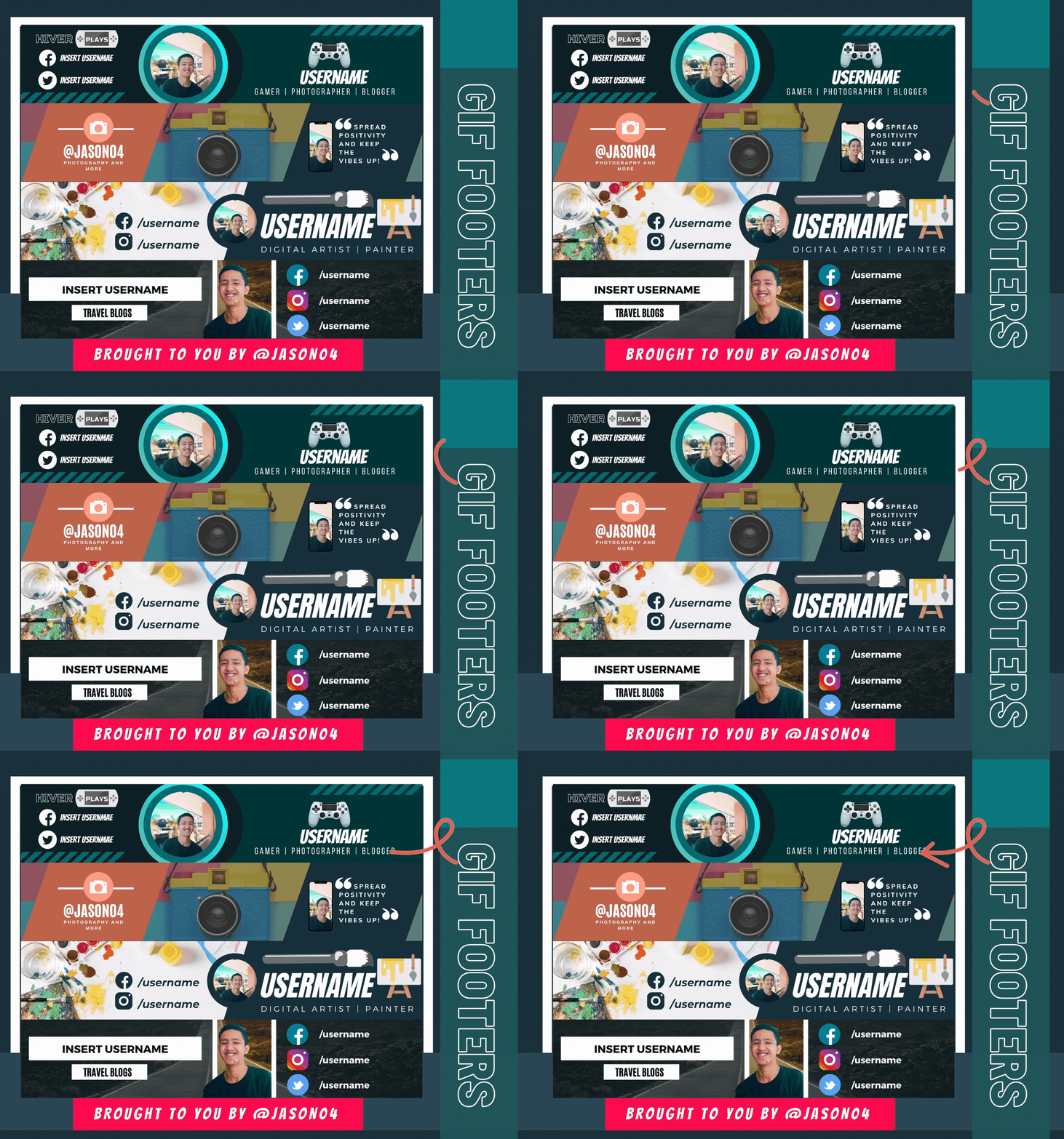
I also sell GIF footers for everyone and please feel fee to contact me if you wanna have yours.
All of those formatting are useless if your content is a trash or is in a bad quality. No matter how good your layout is , if your blog is plagiarized or is a spammed content, your effort in formatting your blog will be put in vain. Might as well have a good quality and legit content. After all, it boils down to the substance of your content and its authenticity. It's just that formatting your blogs in a visually appealing way adds favor to your blog.

Wow. You reached this far? Thank you! That's it for today's blog. Hope you enjoyed it and had fun :)


Very cool and useful postl!! 😊 thanks a lot!
I really mean to make it very detailed for beginners to follow. Always welcomed delilha😁Have a nice day
Not surprised you’re getting compliments. Layout is amazing
Thanks. I really enjoyed doing the layout of my blog. I have fun doing it. I just want my blog to be visually appealing to the readers😁😁Have a nice day @scubahead.
Wow! Inherited gyud? I didn't know na ancestor na diay ko ron. 😂
Anyway, this is very helpful! You have your own way of formatting your blog. Feel jud nako ako ang nag-una2x anang About the Author na part. 🙈
Hive Ancestor/Steem naka kay pila naka ka years diri,HAHAHAHA. Paminaw sad nako ikay gapauso anang About the Author👌👌👏
Great posts - I bookmarked it. It's always good to have post where to send people with questions :)
Thanks for that and for dropping by 😁Have a great day @muscara😁😁
definitely one to bookmark and save for future reference, especially for the thumbnails, been meaninig to learn how to do animated ones for ages.
By the way, do you know how to redsize images? I used to use https://steemitimages.com/300x0/ followed by the uploaded file name, but I don't know how to do in on Hive now. Thanks
@tipu curate
Upvoted 👌 (Mana: 20/40) Liquid rewards.
Same goes for hive @livinguktaiwan.
I mentioned it in my Headings part- The Image Headings. You just changed the" steemitimages.com" to "images.hive.blog".
I greatly appreciate that you take time to visit my blog. Have a good day @livinguktaiwan.
Ha!! Totally missed that as I was skim reading to see what other content you had included. Thanks
No problem @livinguktaiwan😁😁 Hope it helped you👍
Dude... This post is EPIC! I wish i had this when i was first coming on to the scene. You are making me have to step up my quality game! I love it. Great work bro. Keep it up! =) Thanks to Kim for helping get me here. =)
Your comment is lacking something I guess🤔🤔
It's the GIF 😂😂😂. You talk with GIF dude AHHAHAHAHA. Thanks for taking some time to drop by my dude.
I debated on using one or not. I actually made almost all my comments yesterday Gifless. I felt naked... hahahaha

Ya man really awesome write up. You helped me tremendously. Well I learned more in your content than surfing for an hour. Thanks
Thanks for that mate :)
This is so helpful so I am bookmarking it. I often find myself searching every time I want to use a formatting that I am yet to grasp.
I had decided to make this guide because I onboarded one of my friends and she has some questions about formatting. So I made a post about it. I mostly used HTML codes but you could also see the Markdown codes that I attached in my post if you feel using the Markdown. Thanks for dropping by😁
Helpful post on the blog creators on the Hive blockchain.
Thank you for all the information.
Peace
You're very welcome dude👌👌 Thanks for dropping by😁
Woah tis sooo good! I'll save these codes for my future blogs.. thanks youu! Daghana diay nato bisaya oyy hehe
Kaayo, mga lig onkayng bisaya HAHAHAHAH. Btw, choyag mga drawing nmo ster oy, makasuya👏👏
Maayo pod kaayo ka zer huhuh same rataaa
Very helpful specially for beginners like me. Salamuch. Ahmm,unsaon man pgbuhat ug blog dividers?😅
Kung mano2 gyud te kay naay Adobe Illustrator or Inkscape ako ginagamit. Pero naa say Canva te para makahimo ka. Pm nako sa discord te kung magpaguide ka about ani hehe.
Sige, thanks @jason04. Godbless..
Pm lang nyas discord te about sa Canva2, para matabangan taka hehe. Way sapayan te
Congratulations @jason04! You have completed the following achievement on the Hive blockchain and have been rewarded with new badge(s) :
You can view your badges on your board and compare yourself to others in the Ranking
If you no longer want to receive notifications, reply to this comment with the word
STOPWow this is so informative/helpful aside from being greatly presented, I will try some of those sometime, tnx for this Jason, keep up the good work!
Thanks sir long😁 Hope it helped you in some ways😉
Excellent guide. I think that the perfect layout of the content of a blog is essential.
Titles, subtitles, highlighted texts, any image, without spelling errors, everything in its right place. It seems to me a very good guide.
Let's pretend to have a personal blog on Blogger or WordPress for example.
Greetings.
You always have a great looking blog aside from awesome content. Thank you for this one!
You're welcome @maverickinvictus😁😁
Congratulations @jason04!
You raised your level and are now a Minnow!
I agree. Kahit gaano kaganda ang format pero kung wala naman substance ay hindi rin ito quality. Congrats @jason04. Thanks for the very useful and informative post. Makakatulong ito sa mga katulad ko. haha. :)
Reblogged...
Excellent guide! 😍 Thank you for sharing!
Your level lowered and you are now a Red Fish!
Congratulations @jason04!
You raised your level and are now a Minnow!
Thank you Jason for your awesome post. I didn't know we can upload GIF until I read your post. I just tried to create one for my post today using Canva. Do you know if we can use GIF for the profile photo cover?
I am a newbie and your blog really helped me with the html format. Thanks Jason!
The rewards earned on this comment will go directly to the person sharing the post on Twitter as long as they are registered with @poshtoken. Sign up at https://hiveposh.com.
I just join the Hive platform and finding this post is very useful. Thank you and please create more helpful blogs for beginners like me. <3
Thanks mate😄 I am very grateful that my post helped a lot
Hello! Thankfully, I pinned this blog on my Bookmarks on a different Google account and made a mental note to thank you for covering this one up! So now, I'm using my self-made headers and dividers for my blog (and upcoming releases). But may I ask more about the dimensions for each paraphernalia used? Thankieeeee! <3
Before I forget, thanks a lot.This blog helped a lot in my creative process. Nice to meet you, fellow [future] computer engineer, kuya!
Hi elsie.
It has been so long since I created the blog so I haven't really remembered the dimentions I used for those designs. I also lost the canva account I used so I can't give you the dimensions for. Anyway, you can experiment naman sad and see which dimension fits to your liking.
Thanks
My pleasure to help beginners like you shohana😁😁 Have a great day